Work About Resume Let's Talk →
Back to Portfolio
Design System Component Library Teamlance · Tixio · 2019–20

Design System at Tixio

Tixio's product team was moving fast and the UI was showing the cracks: the same components built differently across features, handoffs that generated repeated QA loops, and no shared reference point between design and engineering. I built a design system from scratch covering semantic tokens, a Figma component library with full variant and state coverage, and the process to make it stick across teams.

TL;DR

Problem: No shared foundation. Components built ad hoc, inconsistently, across the product. Designers and engineers working from different references. What I did: Built the design system end-to-end: semantic token architecture, Figma component library with variants and states, light/dark mode support, and cross-team documentation. Impact: Single source of truth adopted by the team. Faster handoffs, fewer QA rounds, and new features built on top of documented patterns rather than from scratch.

Problem

UI components built inconsistently across features. No token system. No shared Figma library. Handoffs slow, QA rounds repeated, design-engineering gap growing as team size increased.

Approach

Audit existing patterns, define semantic token architecture, build component library in Figma with full variant and state coverage, document usage, roll out with engineering alignment.

Scope

Tokens (color, size, typography, spacing, radius, opacity), core components (inputs, buttons, dropdowns, avatars, tables, tags, toggles, notifications), light/dark mode.

My Role

Lead Product Designer · System Architecture · Token Definition · Component Design · Documentation · Design-Engineering collaboration
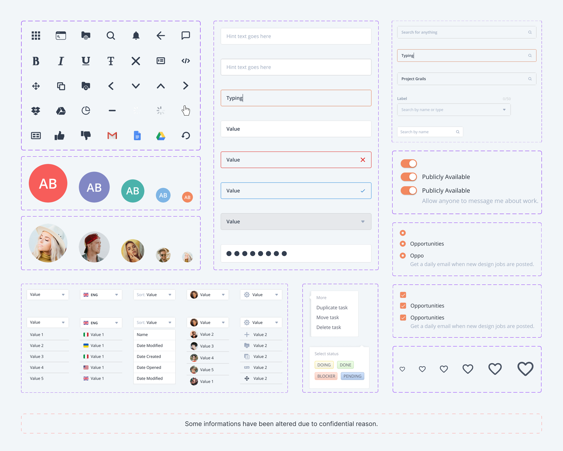
Tixio Design System — component overview showing icons, avatars, inputs, dropdowns, tables, toggles, tags, and notifications

Component overview. Some details altered for confidentiality.

What a fast-moving team without a system looks like

When product teams move fast without a shared foundation, inconsistency compounds. Each sprint that ships without a system makes the next sprint slightly harder. By the time it's visible to users, it's already significant technical and design debt inside the team.

Same component, built five ways

Buttons, inputs, and dropdowns were implemented differently across features: different border radii, different focus states, different spacing. Users noticed the inconsistency even if they couldn't name it.

No shared token language

Without named tokens for colour, spacing, and type, every designer and engineer made independent calls. The result was subtle drift that accumulated into a fragmented visual language over time.

Handoff friction

Handoffs were spec-heavy and slow. Engineers had to guess at states that weren't designed, and designers got screenshots back showing implementations that had diverged from intent.

No room to scale

Every new feature added more surface area without adding structure. The team needed a foundation that would absorb growth, not one that would require a full rework at the next hire.

How I built it: tokens first, components second

The instinct when starting a design system is to jump straight into components. I resisted that. Components built on inconsistent foundations just standardise the inconsistency. Starting with tokens meant every component that came after had a shared base to reference, and a shared language for engineering to map to code.

01. Audit first

Reviewed the existing product to identify recurring patterns, states already in use, and gaps where components were missing entirely. This grounded the system in what the product actually needed rather than what a generic system might include.

02. Define the token layer

Built semantic tokens for colour, size, typography, spacing, radius, and opacity. Semantic naming (active, alert, success, ai, shadow) meant tokens communicated intent, not just value, making them meaningful for both design and engineering.

03. Build and document components

Components built on top of tokens with full state coverage: default, focus, filled, error, success, disabled. Each component documented with usage notes and variant guidance so the team could apply it independently.

Token architecture: semantic, scalable, mode-aware

Tokens were the most important structural decision in the system. I chose semantic naming from the start: tokens named by purpose (active, alert, success, info, shadow) rather than by value (blue-500, red-300). This meant a single token change could propagate consistently across every component that referenced it, and light/dark mode becomes a configuration, not a rebuild.

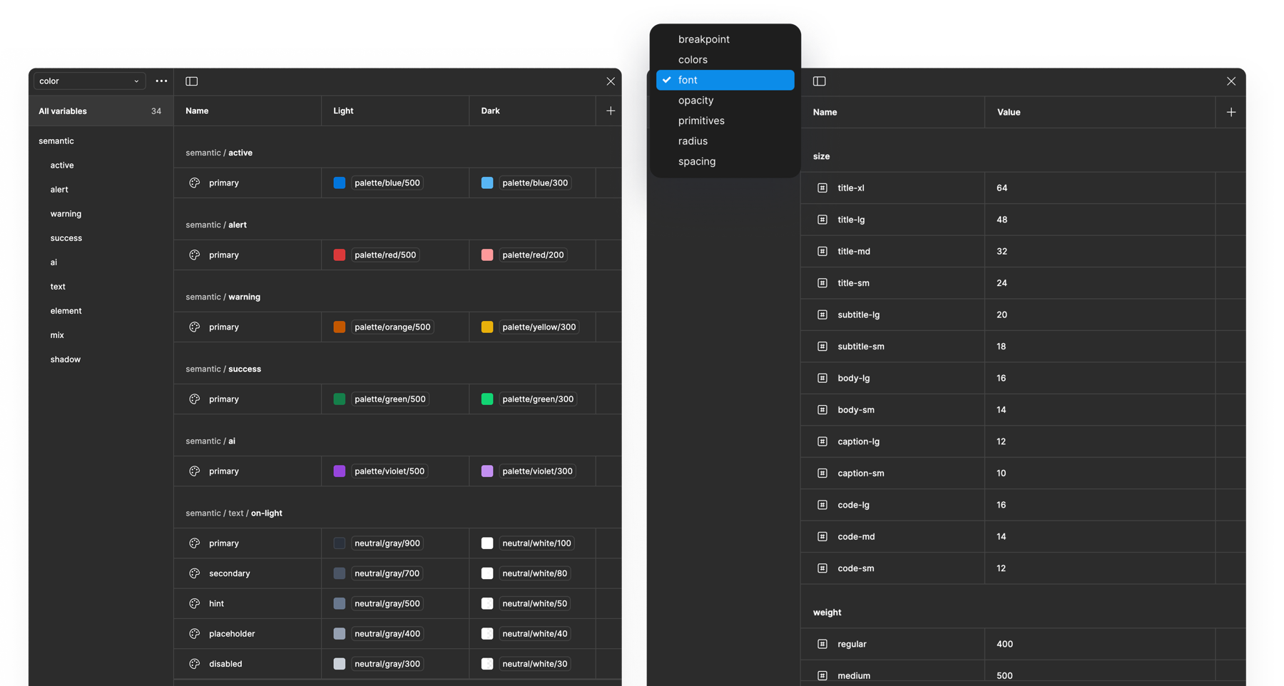
Design token architecture — semantic colour tokens with light/dark values and size/typography scale in Figma

Token panel in Figma showing semantic colour tokens paired with light and dark mode values, alongside the size and typography scale.

Semantic colour tokens

Tokens named by role: active, alert, warning, success, info, shadow. Each paired with a light and dark value. One token name covers both themes, so components didn't need to know which mode they were in.

Size and type scale

A defined size scale for file icons, body text, captions, and code across lg/md/sm steps. Typography weights mapped to named tokens (regular/medium) rather than raw numbers, keeping specs readable for both disciplines.

Full token categories

Token architecture covered breakpoints, colours, font, opacity, primitives, radius, and spacing, giving every design decision a named reference point rather than a magic number.

Buttons: one component, every combination covered

The button was the first component I built end-to-end because it exposed the most design decisions in the smallest surface area: how to handle size, style, state, icons, and colour all at once. Getting it right here made every subsequent component faster to build.

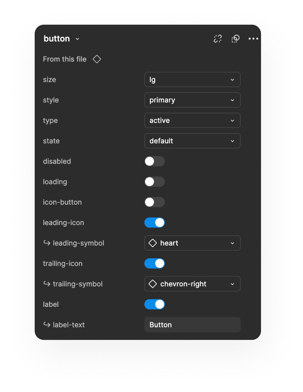
The component was built as a single Figma component with properties controlling size, style, type, state, disabled/loading toggles, and leading/trailing icon slots. This meant the team could configure any button variant from one source rather than maintaining separate components per style.

Button component properties panel in Figma — showing size, style, type, state, icon, and label controls

Component properties: size, style, state, icon slots, label. One component, configured through properties.

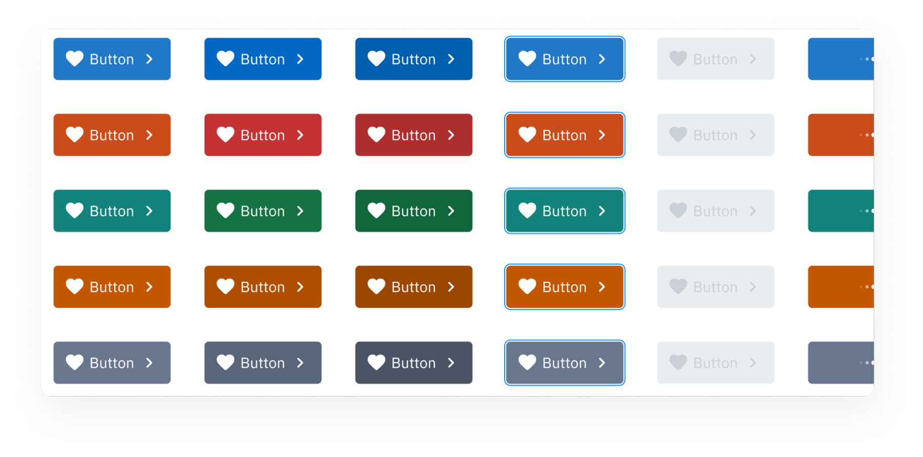
Button colour variants — showing primary, red, green, orange, and neutral colour themes across active, hover, pressed, focused, and disabled states

Colour variant matrix. Each theme runs through the same state sequence, keeping visual logic consistent.

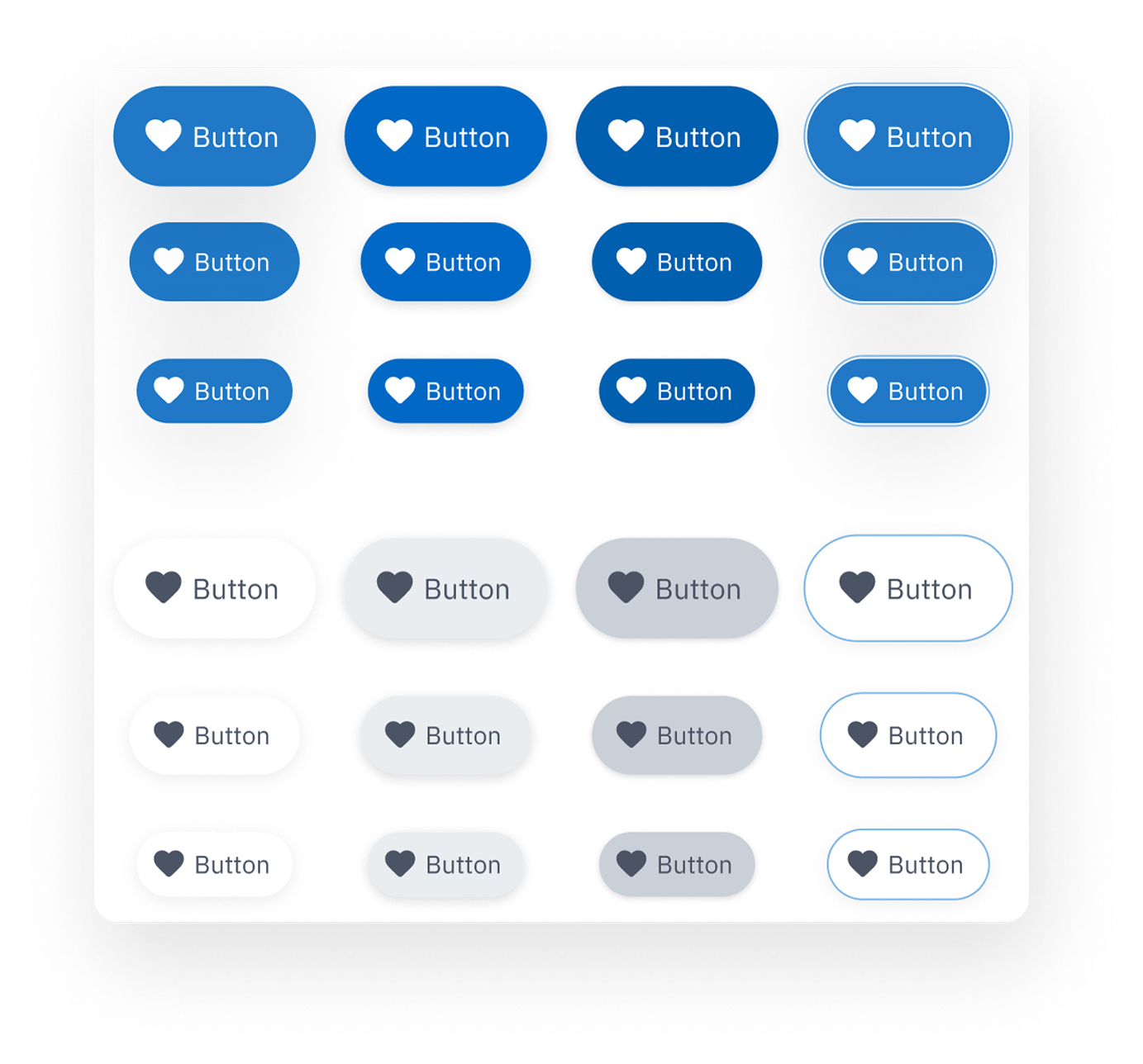
Button shape variants — filled and outline styles in pill and rounded shapes, light and dark modes

Shape variants: filled and outline styles across pill and standard radius, supporting both light and dark background contexts.

Property-driven architecture

Size (lg/md/sm), style (primary/secondary/ghost/outline), state (default/hover/pressed/focused), and icon slots all controlled by Figma component properties. One source, every combination.

Full state coverage

Active, hover, pressed, focused, disabled, and loading states covered for every style. Engineers had a spec for every scenario before asking.

Icon flexibility

Leading and trailing icon slots built into the component. Teams could add icons, remove them, or use icon-only mode without breaking the layout or needing a separate component.

Input fields: every state, every variant

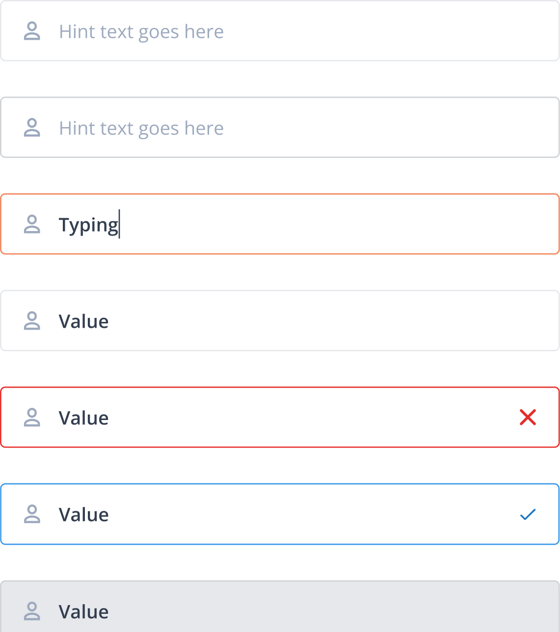
Input fields carry more states than almost any other component. A system that only documents the default and error states leaves teams guessing at focus, filled, success, and disabled. I built all of them explicitly, across every structural variant.

Input field states with leading icon — default, focus/active, filled, error, success, disabled

Leading icon variant: 7 states from default through disabled.

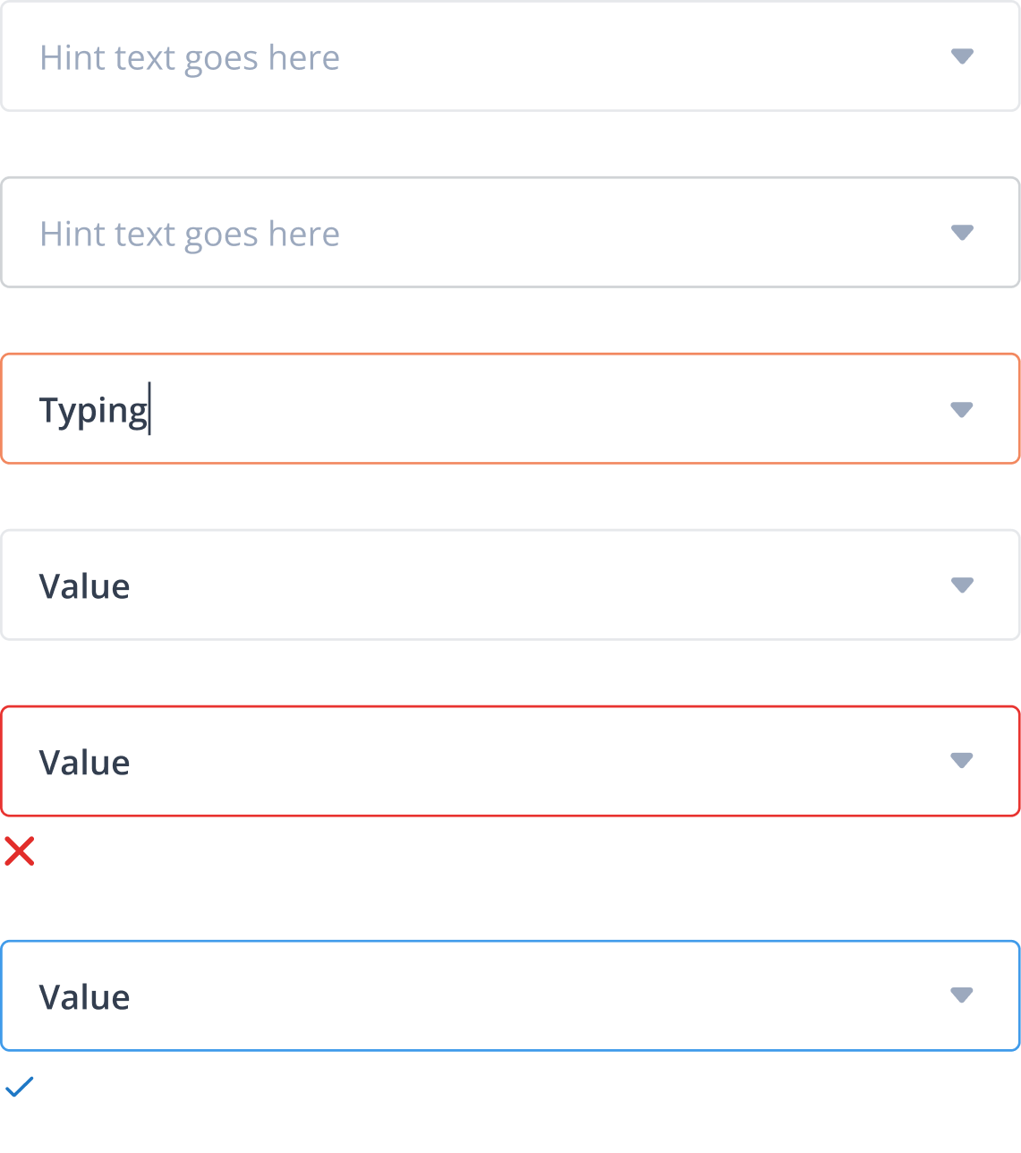
Input field states with trailing dropdown arrow — select/combobox variants with all states

Trailing icon variant, used for select and combobox patterns.

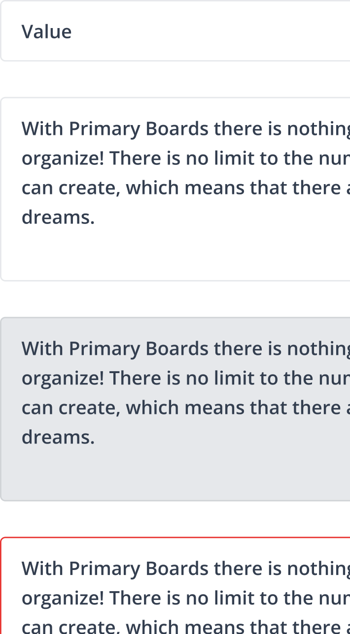
Textarea input variants — default, filled, disabled, and error states

Textarea variants, same state logic extended to multi-line inputs.

States documented across all variants

Default (borderless) Default (bordered) Focus / Active Filled Error Success Disabled

Each state uses a distinct visual signal: focus triggers an orange border, error uses red with an inline X icon, success uses blue with a checkmark, disabled uses a muted background. Consistent colour semantics across components tie these signals to the token layer.

Dropdowns: five variants from one pattern

Tixio needed dropdowns that could handle more than a plain list of text options. The product used language selectors with flags, sort controls with labelled options, user pickers with avatars, and action menus with icons. Rather than building each separately, I designed a variant system that shared the same structural logic across all of them.

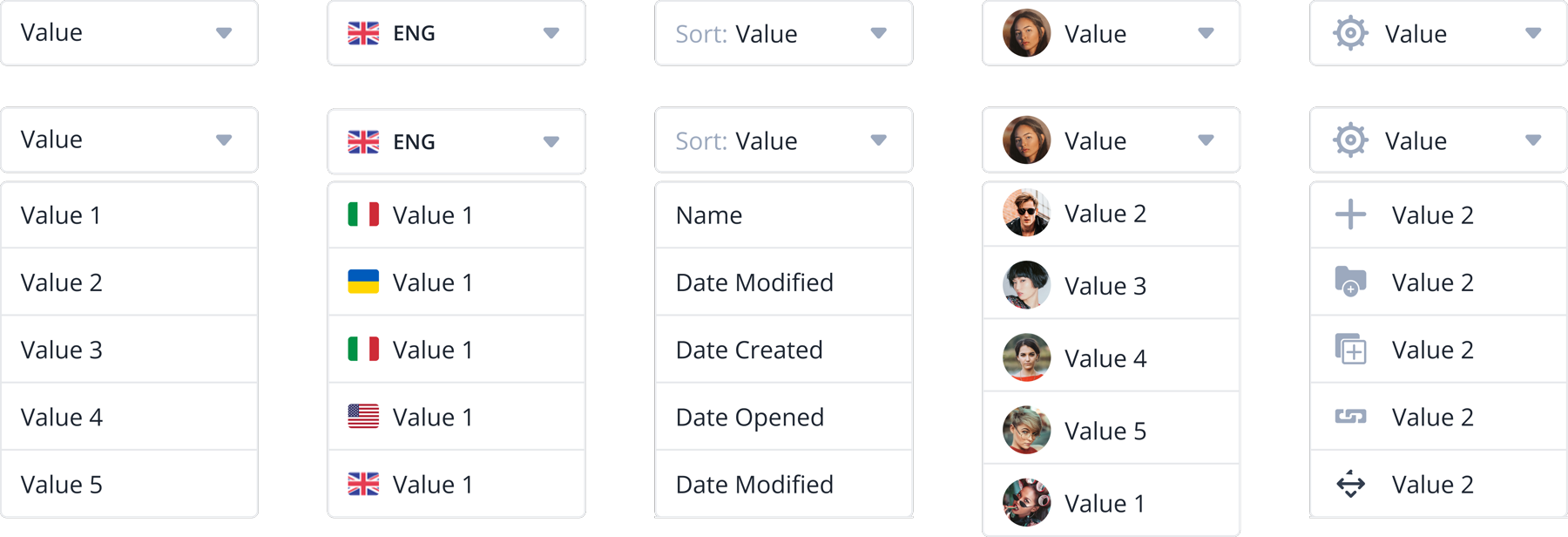
Dropdown component variants — basic, language/flag, sort, user/avatar, and icon+action types, each shown open and closed

Five dropdown variants, each shown in closed and open state. From left: basic, language/flag selector, sort control, user/avatar picker, icon with action items.

Shared structure, different content slots

All five variants share the same trigger element, open/close behaviour, and selection pattern. What changes is the content slot: plain text, flag + text, label prefix, avatar + text, or icon + text. This kept the interaction model consistent while covering Tixio's real use cases.

Product-grounded variants

The variants weren't designed speculatively. Language selectors, sort controls, user pickers, and contextual action menus were all patterns already in the product. The system gave each a documented, consistent form rather than leaving them to be re-solved feature by feature.

The full component set

Beyond buttons, inputs, and dropdowns, the system covered the full range of components Tixio's collaboration product needed: icons, avatar states, data tables, toggles, status tags, notifications, context menus, and more. Every component followed the same token-based foundation and state logic.

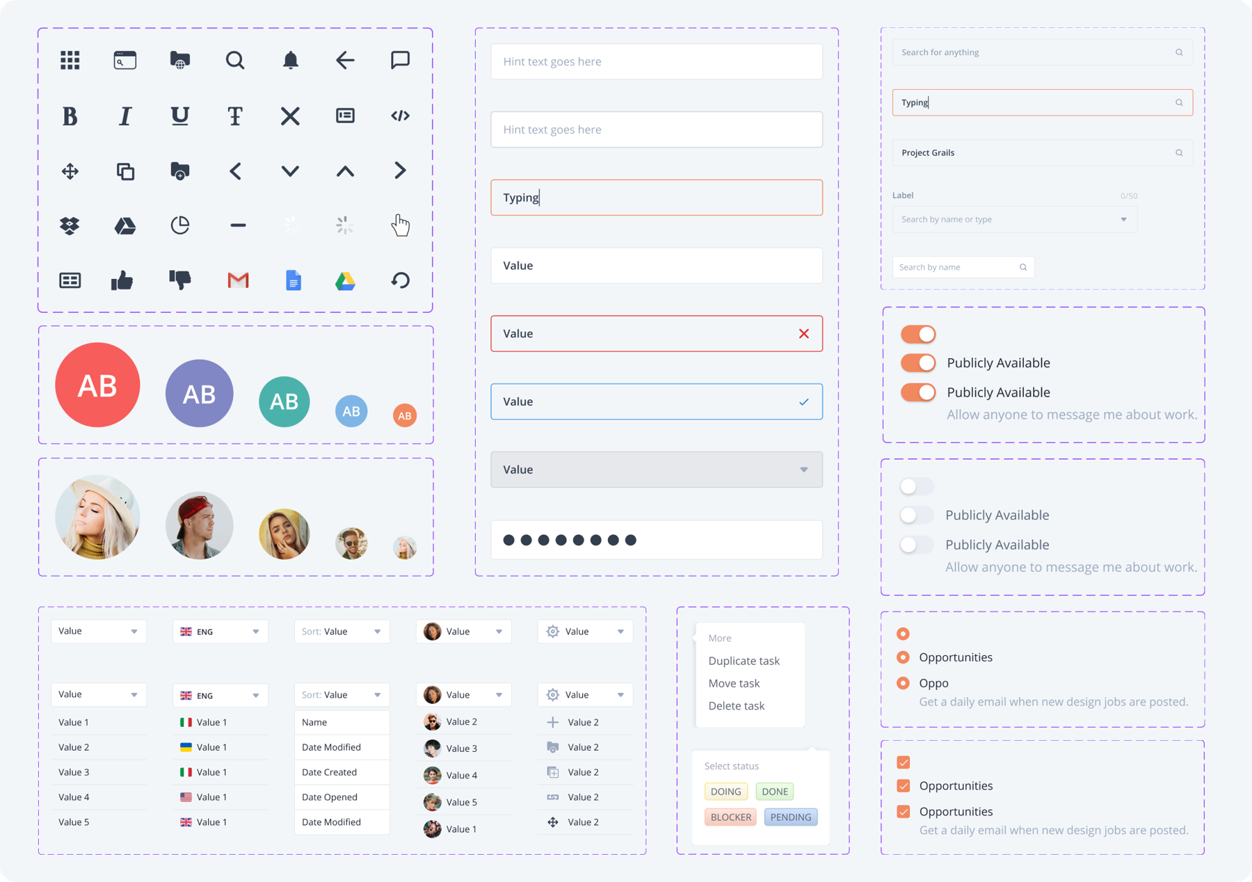
Tixio Design System — full component overview including icons, avatars, inputs, dropdowns, tables, toggles, status tags, notifications, and context menus

Component overview. Some details altered for confidentiality.

Icons & Avatars

A consistent icon set covering navigation, editing, social, and integration symbols. Avatar components with initials, coloured variants, photo states, and group/stacked configurations, each at multiple sizes.

Tables & Data

Table components designed for Tixio's data density: columns supporting text, flag/locale, user avatars, and sort controls. Action menus (duplicate, move, delete) built as a consistent contextual pattern.

Status & Feedback

Toggles with clear on/off states, status tags (DONE, IN PROGRESS, BLOCKED, PENDING), notification components, and reaction/like patterns, all using the same semantic colour tokens as the rest of the system.

Decisions that shaped the system

A design system is full of small decisions that compound. These were the ones that shaped how the system held together and scaled.

Semantic tokens over primitive values

Naming tokens by purpose (active, success, alert) rather than by value (blue-500) meant designers and engineers shared the same vocabulary. It also made light/dark mode a token swap, not a component rebuild.

Full state coverage from the start

Every component was designed with every state before it was handed off. This avoided the pattern where engineers get a default and error state and have to guess at the rest, which was exactly what was happening before the system existed.

Variant systems over separate components

Buttons with different colours, dropdowns with different content types: these were variants of one component, not separate components. Fewer components to maintain, more consistent behaviour, easier for the team to navigate.

Grounded in what the product needed

The system was built from an audit of what was actually in the product, not from a generic component checklist. This kept scope controlled and ensured the system was immediately useful rather than aspirationally complete.

What changed once the system was in place

The impact of a design system isn't always measurable in a single metric. It shows up in the pace of new feature work, the quality of handoffs, and the conversations that stop happening because everyone already shares a reference point.

1 source

Single source of truth

Designers and engineers referencing the same Figma library and token set, rather than each feature having its own interpretation of a component.

↓ QA

Fewer handoff loops

Engineers stopped guessing at states that weren't specified. The system provided the answer before the question was asked.

↑ Speed

Faster feature work

New screens built from components rather than from scratch. Design time shifted from rebuilding to composing. New team members could contribute without creating inconsistency.

2 modes

Light & dark ready

Semantic token architecture meant light/dark mode was a configuration change, not a second system. Every component already referenced tokens that had both mode values defined.

What this taught me about systems work

The hardest part of building a design system isn't the components. It's the decisions that happen before the first component is built. Token naming, variant strategy, scope definition. Get those right, and the components follow logically. Get them wrong, and every component becomes a negotiation.

The other thing I carried away from this project: a design system is a team product, not a design artefact. It only has value if the people building features trust it and reach for it. That means the rollout and the communication matter as much as the system itself. The best-architected library that no one uses is worthless. Getting buy-in from engineering early, and keeping the system grounded in real product needs rather than ideal-state completeness, was what made this one stick.