Work About Resume Let's Talk →
Back to Portfolio
SaaS UX Design Happeo Oy · 2022–23

Search & Filters Revamp

Happeo's search was a daily frustration, users averaged 45 seconds to find anything, over a third gave up before getting a result, and integrations like JIRA and Slack were buried in a horizontal scroll that most users never discovered. I led the full redesign: from audit and research through to shipped product. Result: search time dropped to 7 seconds, successful searches jumped from 60% to 85%, and drop-off rate fell from 25% to 10%.

TL;DR

Problem: Search was slow, filters were invisible when active, and integration results were buried, making Happeo feel unreliable as an information layer. What I did: Design audit, customer surveys, co-design with the team, high-fidelity redesign, Maze usability testing. Also led AI search analytics work translating user needs into algorithmic requirements. Impact: 45s → 7s search time. 60% → 85% success rate. 25% → 10% drop-off. 8.4/10 ease-of-use score.

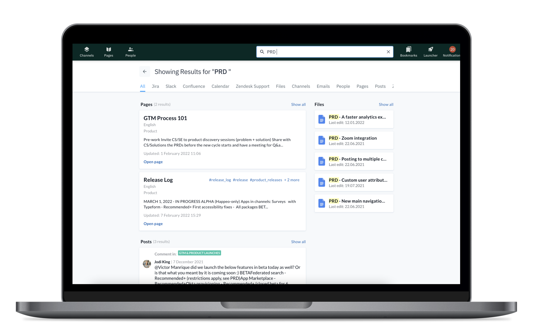
Redesigned search and filter experience, full interaction walkthrough

Problem

45-second average search time. 40% of searches failed to surface a useful result. Integrations (JIRA, Slack, Drive) were buried in a horizontal scroll tab no one discovered. Active filters had no visible state, leaving users confused about what was applied.

Approach

Design audit → customer survey → 16 customer + 7 stakeholder interviews → co-design sessions → high-fidelity prototype → Maze usability test → post-launch Pendo tracking.

Evidence

Survey data from real users, Maze usability test (8.4/10 ease of use, 74 findability score), post-launch Pendo analytics tracking time-to-result, click path, and search success/failure ratios.

My Role

End-to-end ownership: design audit, research synthesis, wireframing, hi-fi UI, competitor analysis, usability testing, success metric definition, and post-launch AI search analytics work.

What the survey and audit revealed

The survey and design audit converged on the same core issues. Users weren't failing to use search, they were actively trying and failing. The problems weren't cosmetic; they were structural.

Fragmented integration access

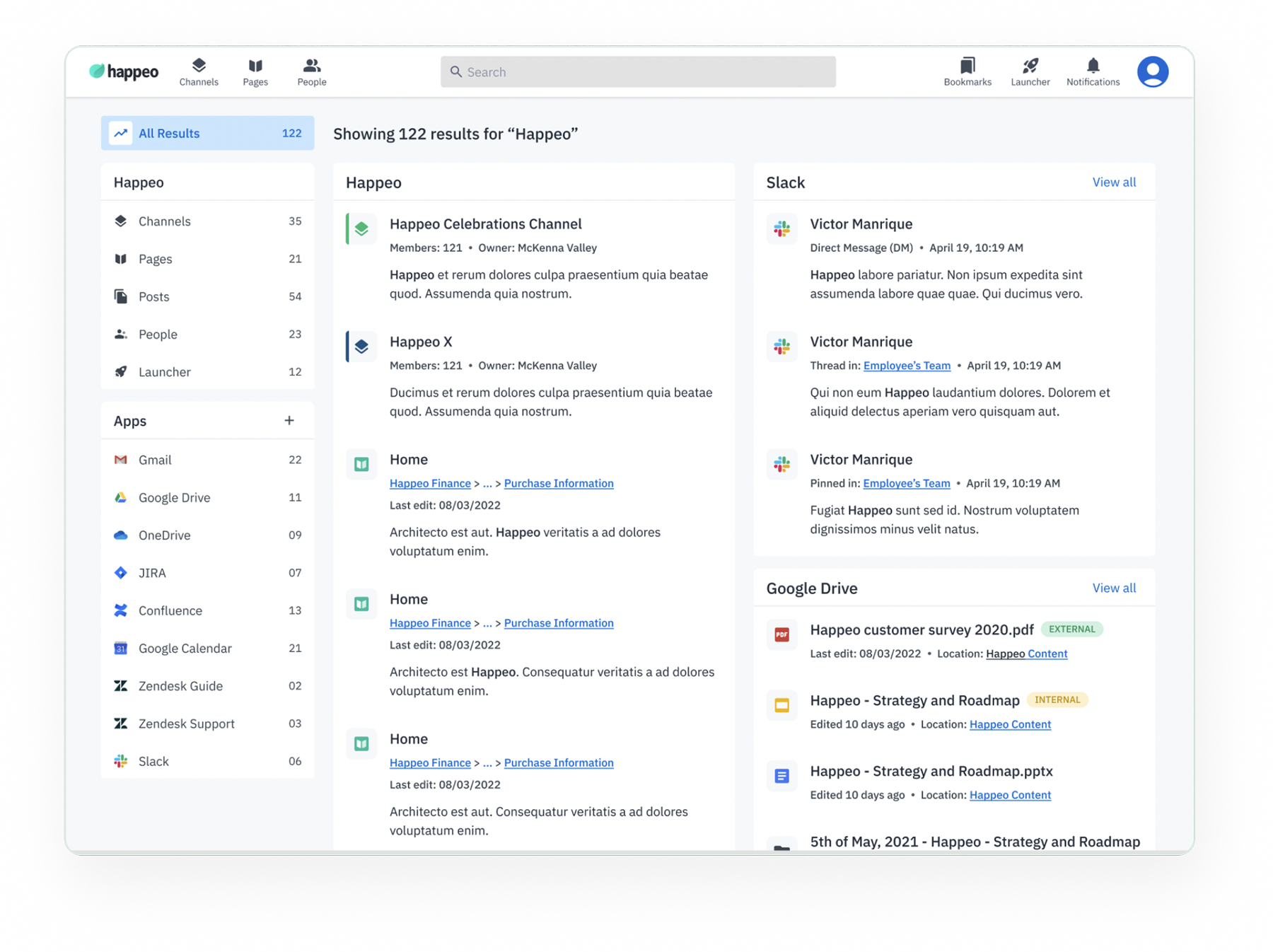
JIRA, Slack, and Drive results were buried in a horizontal tab row that most users scrolled past. Treating third-party results as a separate category made Happeo feel like it couldn't surface the work that actually mattered.

Invisible filter state

Users applied filters but had no persistent view of what was active, leading to repeated filter applications, confusion about why results weren't changing, and eventual abandonment of the feature entirely.

Result cards lacked context

Cards showed titles but not enough surrounding context to help users decide whether to click. Users described scanning several results, not finding the right one, and giving up, not because it wasn't there, but because nothing differentiated it.

Inconsistent design patterns

Search looked and behaved differently across parts of Happeo. Users described this as "feeling like a different app", eroding trust in the search system as a reliable tool.

AI and personalisation demand

Users wanted search that learns, saved searches, personalised ranking, and AI suggestions. This informed a parallel AI search workstream I contributed to alongside the core redesign.

Thumbnails and previews missing

In a tool with rich visual content (channel cover images, page banners, user avatars), search results were text-only. Adding visual anchors, a consistent request, was prioritised for the new result card design.

Audit: Old designs

Old search & filters design audit

1. Buried integrations tab

JIRA, Slack, and Drive results were hidden inside a horizontal tab row. Most users never scrolled to it, so third-party content was effectively invisible.

2. No comment context

Comment results showed the comment text but nothing around it. Users couldn't judge relevance without clicking through, so most didn't bother.

3. Truncated search bar

The search input cropped long channel and page names before users could read them, forcing extra clicks just to confirm they'd found the right result.

4. No active filter summary

Applied filters had no persistent summary view. Users couldn't tell what was active, why results looked sparse, or how to clear a filter without starting over.
Success metrics definition

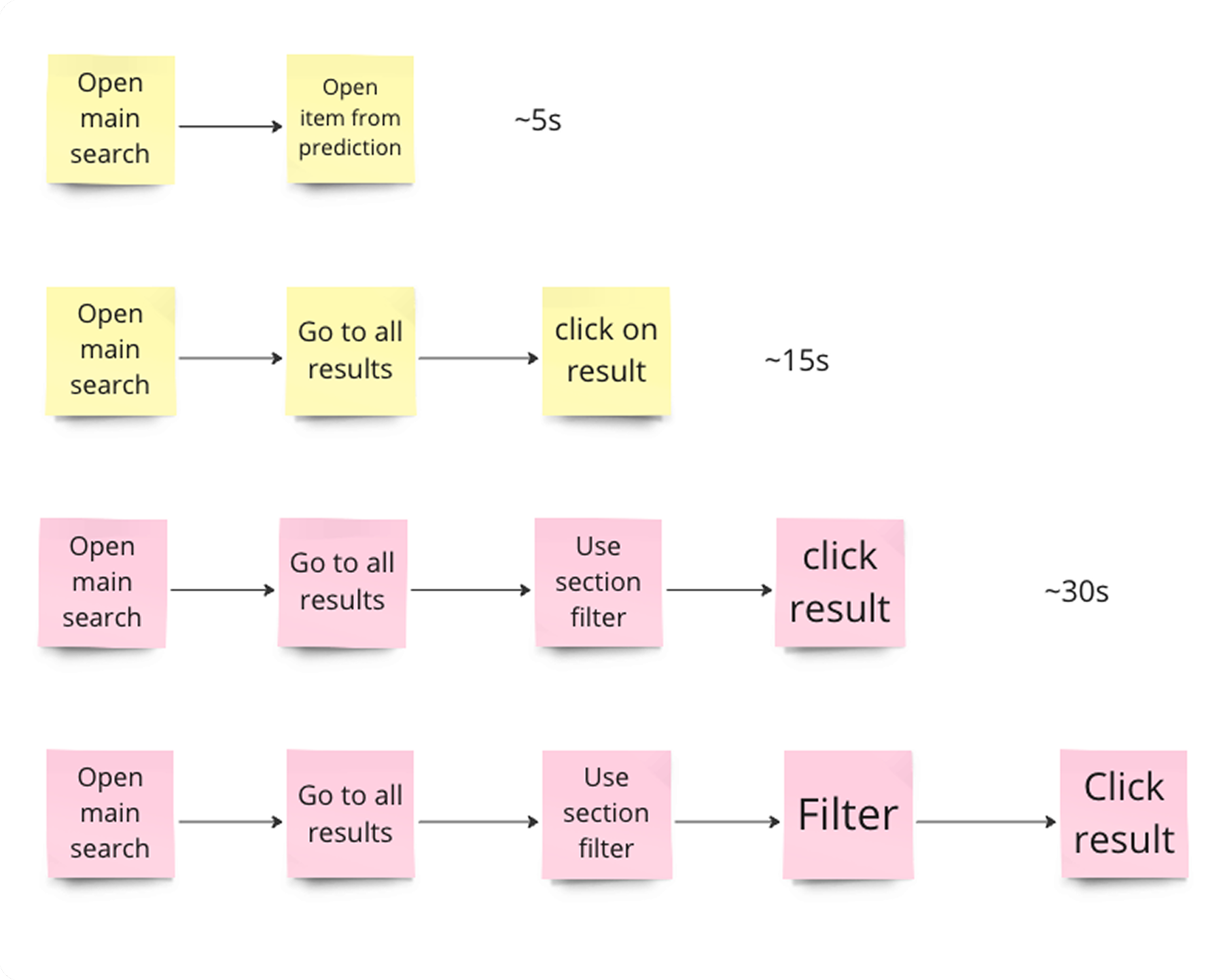
Before the redesign shipped, I defined three metrics with the PM to confirm the new search actually solved what we'd diagnosed. We needed numbers that would tell us if users were getting to results faster, failing less, and not abandoning mid-search.

Metrics we tracked:

  • Successful vs. Failed Searches: Did users reach a result they clicked? This was the core signal for whether search was working.
  • Time to Result: How long from query to first meaningful click. Baseline was 45 seconds, which was the clearest sign something was broken.
  • Click Path: The number of steps between searching and finding, flagging dead ends and unnecessary detours.

Two data methods:

  • Event Tracking: Every search result click captured, letting us distinguish successful sessions from abandoned ones.
  • Funnel Analysis: Full journey mapped from query to result click, exposing exactly where users were dropping off.
Success metrics chart

Co-design session and usability testing

Co-design sessions with the team shaped the layout and result card details around what the API could actually deliver. I moved those into high-fidelity, ran a Maze usability test, and used the results to tighten the experience before shipping. The test surfaced where users hesitated, where they succeeded without thinking, and what needed adjustment on the card designs.

Co-design wireframe session 1 Co-design wireframe session 2
8.4 Ease of use rating: 8.4/10, reflecting high satisfaction with simplicity and user-friendliness.
7.7 Meeting expectations rating: 7.7/10, indicating good alignment with customer needs.
74 Findability: Usability score of 74 for locating the "happeo_fc" Slack channel, suggesting areas for improvement in findability.

"You solved a couple of the issues that I presented as expectations for an improved search experience. e.g. more consistent UI, better use of visuals and icons. Less text heavy. And most important search results coming in one pane (one place to look) on the right."

— Bram Koster (Randstad)

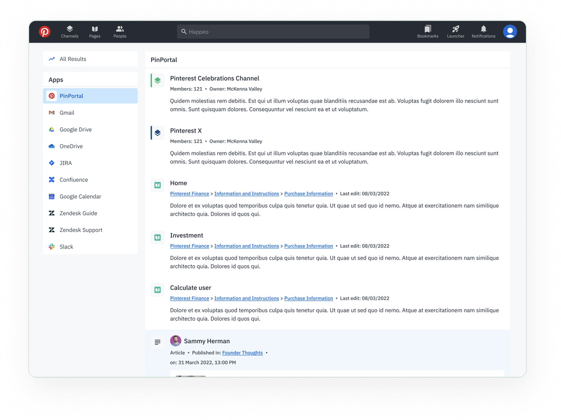
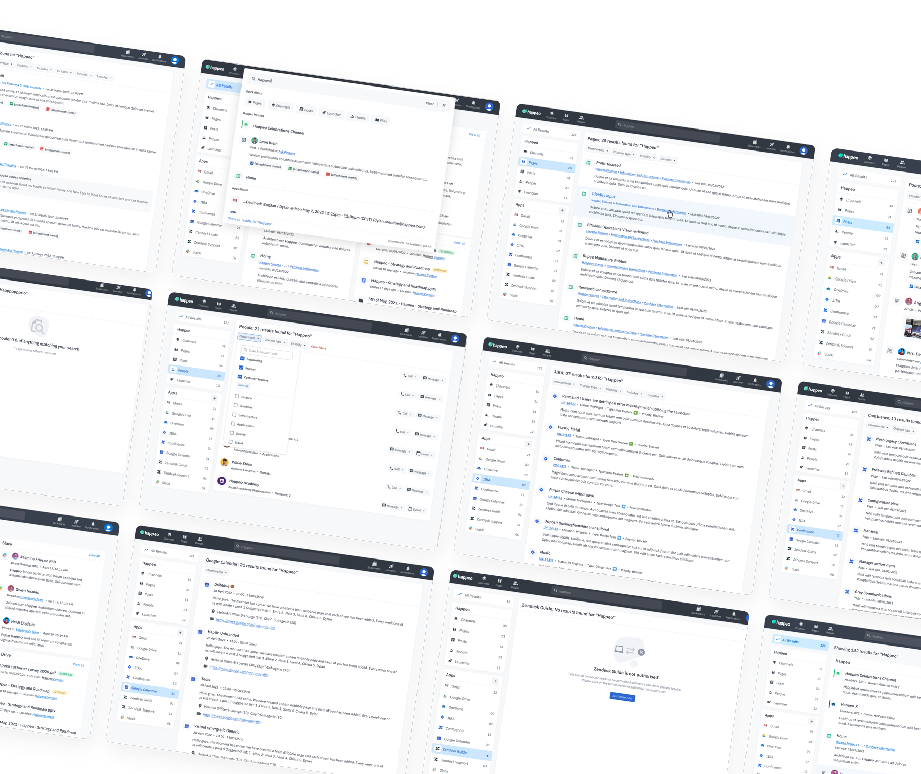
Final designs

Search & Filters — final design screens

What users told us after launch, and what changed

Beta survey, a polarised result

Beta satisfaction scored 2.59/5: a polarised result rather than a mediocre one. 23 users gave it 5/5, calling out the improved UI, better filtering, and cleaner result cards. 39 gave it 1/5, focused on a specific problem: content like HR policies and how-to guides was still hard to find, not a UI problem, but a search relevance and indexing problem that went deeper than the design layer.

Customer interview themes (16 customers, 7 stakeholders)

  • Relevance over speed: The new interface felt faster, but users wanted search accuracy to improve alongside it, ranking the right content, not just returning it quickly.
  • Mobile gaps: The redesign was primarily desktop-first. Mobile accessibility emerged as a follow-up priority.
  • AI and personalisation: Strong demand for saved searches, personalised rankings, and AI-driven suggestions, directly influencing the AI search workstream I contributed to next.

The polarised beta result was valuable data, not a failure signal. It told us exactly where the design alone couldn't solve the problem, and where to direct the next iteration.

Search relevance, the next frontier

The UI redesign shipped first. But post-launch feedback made clear that search relevance was the next critical problem. I led the design side of an algorithm refinement effort and a parallel AI search analytics initiative, translating user behaviour and interview insights into actionable requirements for the engineering and AI teams.

Prioritized Content Grouping

Collections appear first, making key content easy to find.

Improved Relevance

Titles and descriptions with keywords like "sales" are ranked higher, while hashtags refine results when multiple matches exist.

New Result Order

Pages, Channels, and Collections rank higher than users or posts for faster access to vital resources.

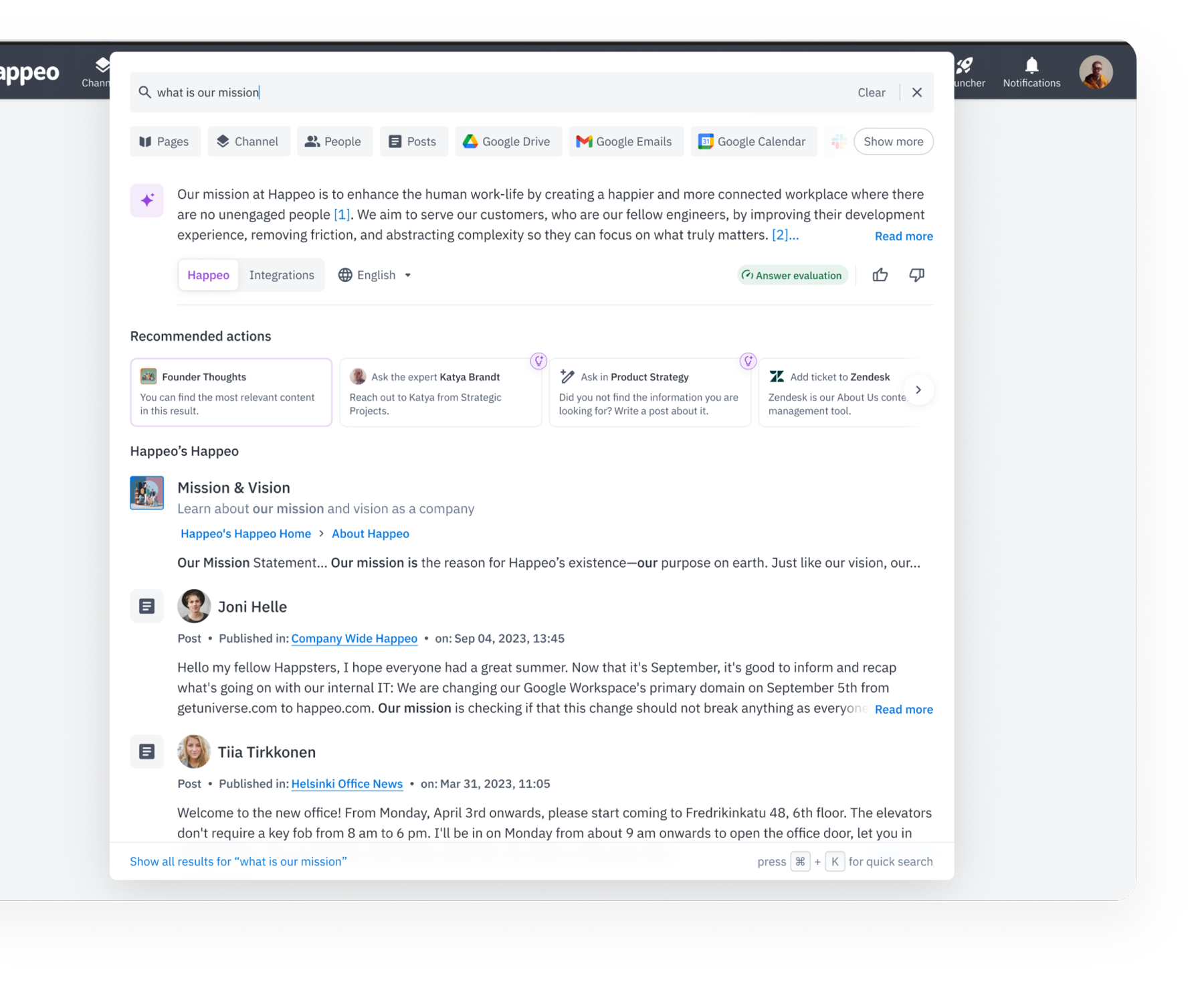
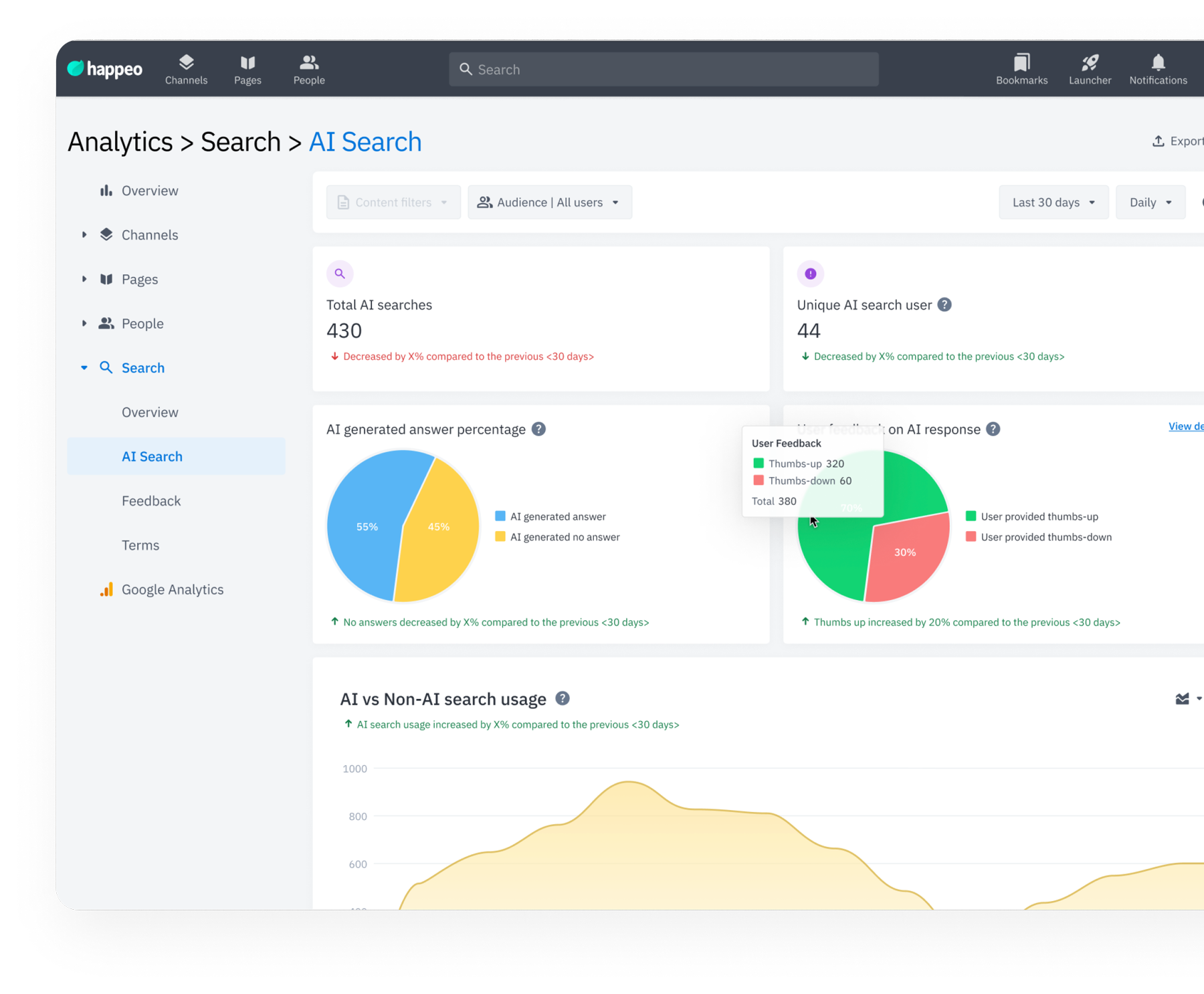
Search AI insights

Synthesised 16 customer interviews into ranked signal priorities for the AI team: what content to weight, what to filter, and where relevance was breaking most visibly.

Search AI Analytics

Designed the analytics layer to track search precision and satisfaction after each algorithm change, so improvements were measurable rather than assumed.

Feedback loop

Established a closed loop between user behaviour data and engineering, so each relevance change had a clear before/after signal tied to real user outcomes.

Enhancing search — AI search analytics 1 Enhancing search — AI search analytics 2

Release Impact

The metrics we defined at the start confirmed the redesign delivered. Search was faster, more accurate, and far less likely to send users away without a result.

7s Search times dropped from 45 to 7 seconds, with quick search modal usage increasing by 33%, enabling faster access to relevant content.
25% Successful searches increased from 60% to 85%, with 90% of users selecting results within the top three listings.
15% Drop-offs during the search process decreased from 25% to 10%, ensuring smoother navigation.

Search as a strategic product investment

Transforming Happeo's search from a frustrating bottleneck into a fast, reliable experience required more than a UI refresh, it demanded a full rethinking of how search results surface, filters communicate, and integrations are discovered. The measurable outcomes (45s → 7s, 60% → 85% success rate) validated that focused, research-backed design work creates compounding value.

Key learnings: earlier user interviews would have closed gaps faster, and AI-powered search, though handed to another team, gave me valuable exposure to translating user needs into algorithmic design requirements. This project sharpened my ability to design for complex, data-rich SaaS environments at scale.