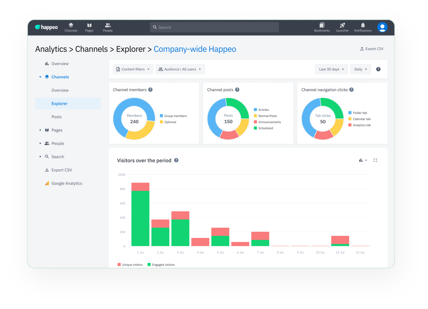
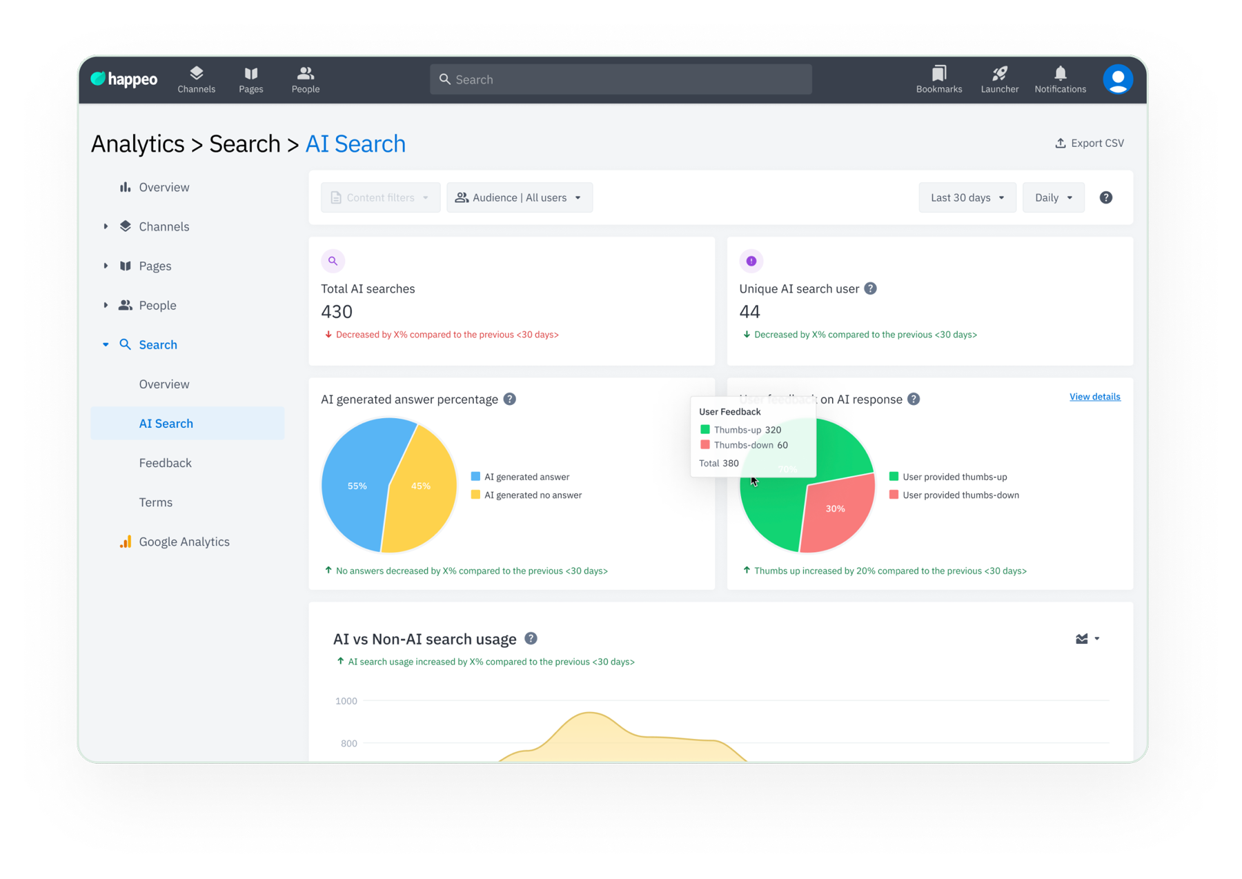
Enterprise admins were flying blind. Happeo's analytics showed company-wide numbers but couldn't tell you which department actually read your announcements. I led the end-to-end design of advanced audience, channel, and content filters: from research with 10+ enterprise customers through to validated, shipped product. The result: a 100% task success rate in usability testing, and filters now used by organisations with 46,000+ employees to track engagement by team, location, and content type.
TL;DR
Problem: Admins at large enterprises couldn't filter analytics by audience, department, or content type, only company-wide averages were available. What I did: Led research, IA, interaction design, and usability testing across the full feature set. Collaborated with PM and engineering to ship audience, channel, post and page filters. Impact: 8.5/10 ease-of-use rating, 100% task success rate, and measurably higher engagement from enterprise accounts, department filter alone accounts for 25% of all filter activity.
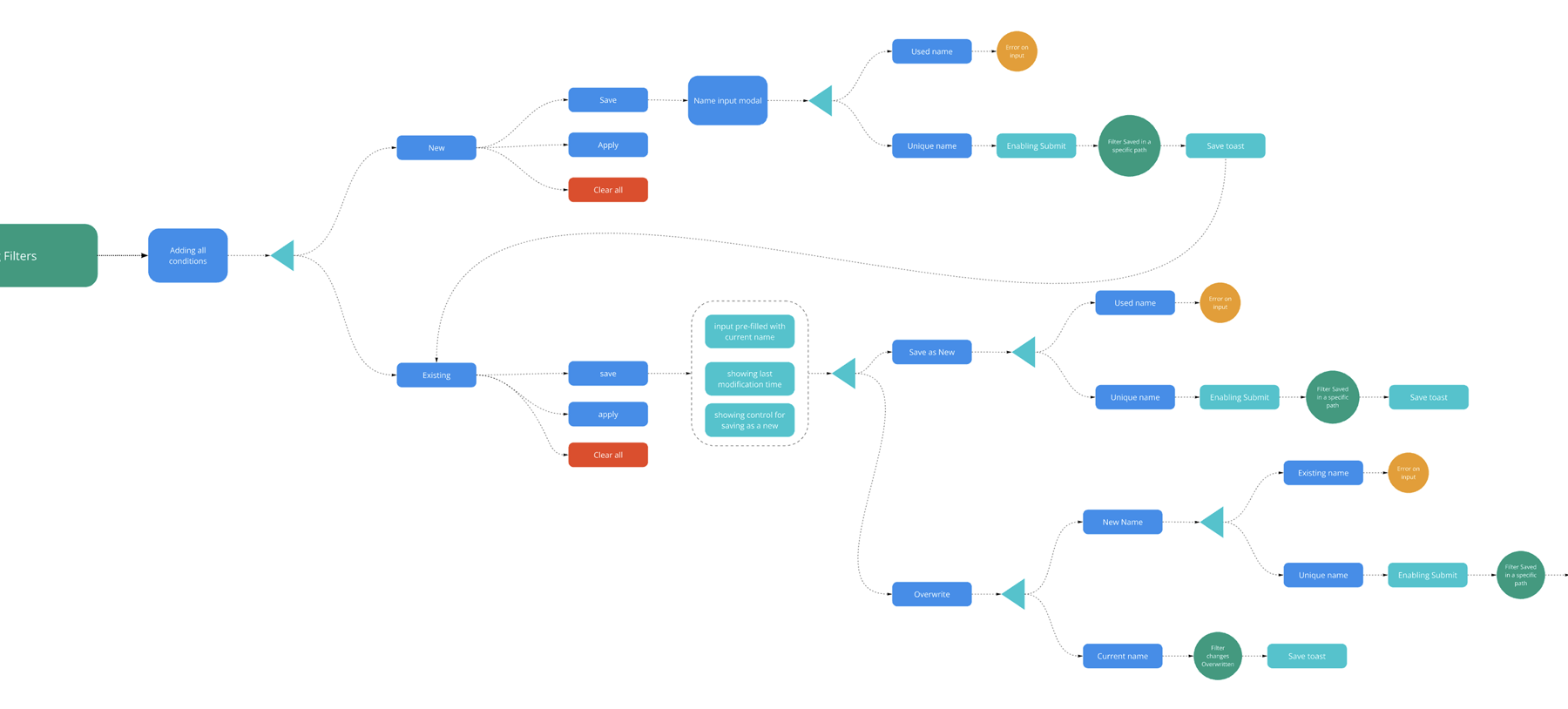
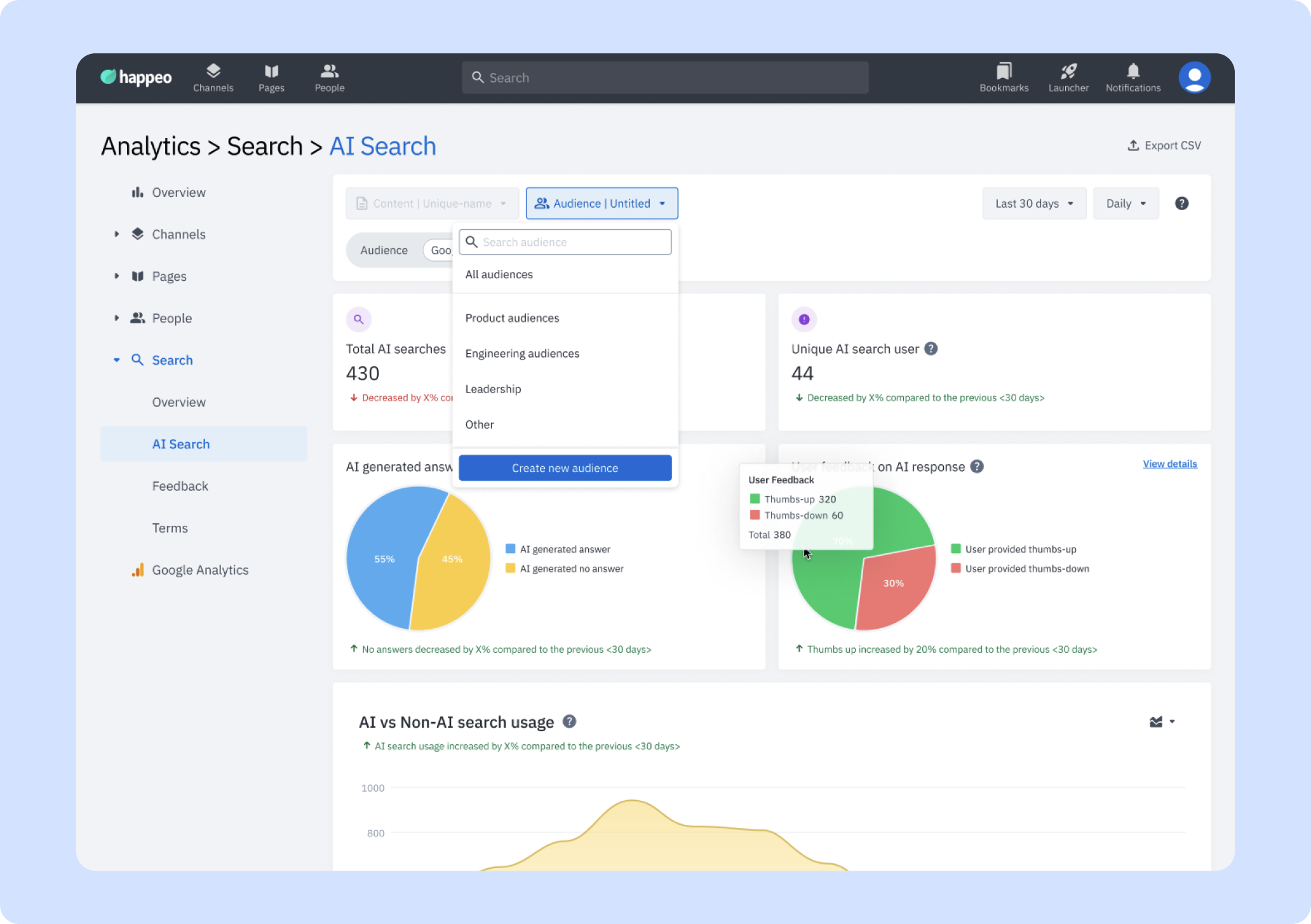
Applying, saving, renaming and managing audience filters
Problem
Analytics showed only company-wide totals. Admins at large enterprises had no way to filter by department, location, channel, or content type, making the data nearly useless for real decisions.
Approach
Interviews with 10+ enterprise customers, competitive analysis across analytics tools, iterative design with 2 rounds of Maze usability testing.
Evidence
Customer interviews (Randstad, Visma, GWI, Venturewell), Maze usability sessions, post-launch analytics via PostHog. Results tracked 6 weeks after release.
My Role
End-to-end ownership: research synthesis, IA & interaction design, UI, usability testing. Collaborated with PM (James Dashwood) and engineering on scoping and delivery.
Team
Junaed Numan (me), James Dashwood (PM), Engineering team and other stakeholders.
What We Built
Three filter types, one connected system
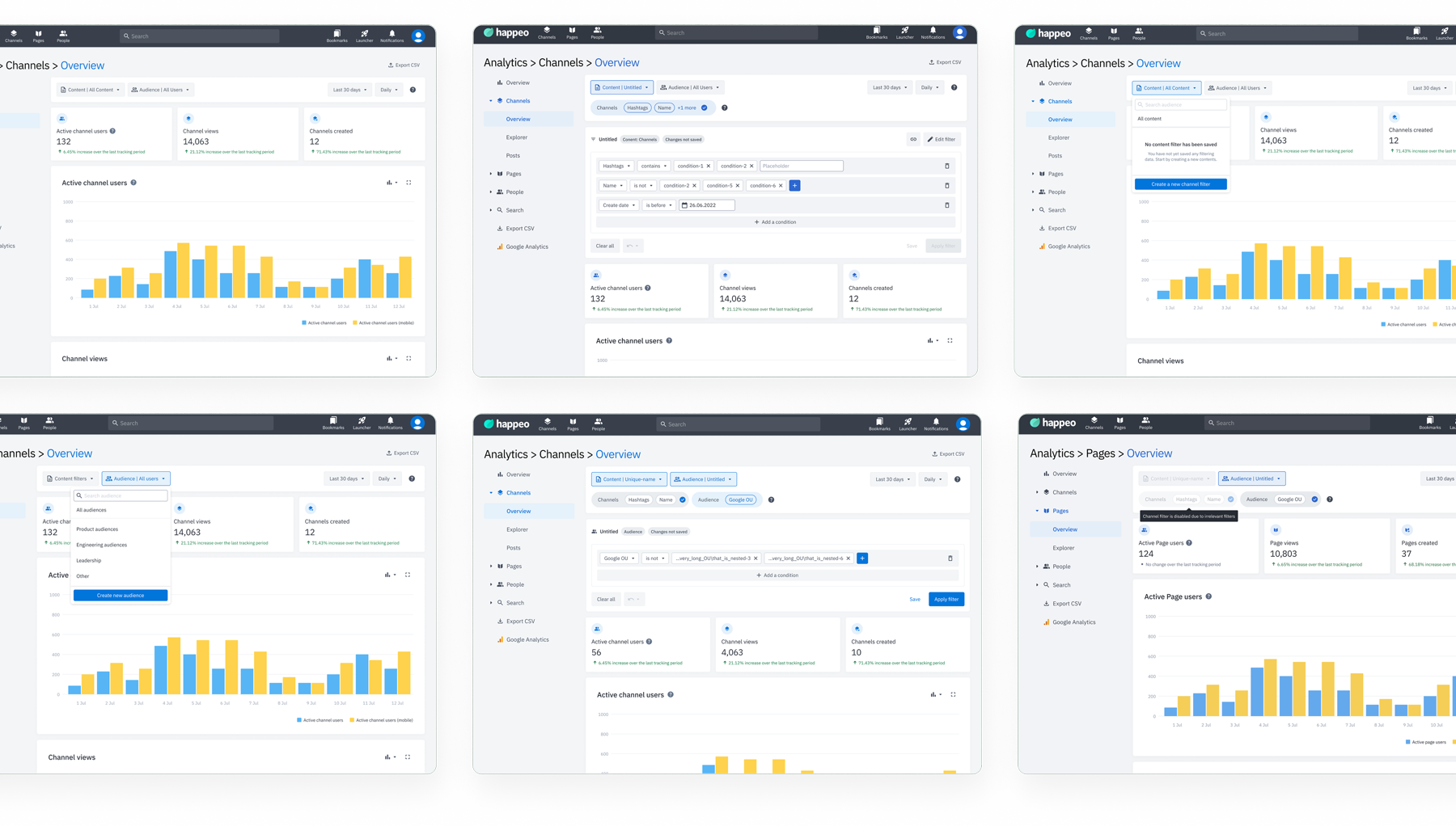
The key design decision wasn't which filters to build, it was how to make three different filtering contexts feel like one coherent system. We defined a shared interaction model across all three analytics surfaces so that the mental model, the save pattern, and the export behaviour worked the same way regardless of which surface you started from. Admins who learned audience filtering got channel and content filtering for free.
Audience Filters
Filter the full analytics dashboard by people segments, date range, department, location, and custom org attributes. The most-used filter type among enterprise accounts.
Channel Filters
Isolate and compare individual channel performance. Useful for comms teams tracking whether specific channels are reaching the right audiences.
Post & Page Filters
Drill into content-level performance, filter by post type, date range, and author to understand which content formats and topics drive real engagement.
Research
What enterprise admins actually needed
We interviewed admins at 10 organisations, including Randstad (46,000 employees) and Visma (13,500 employees). The pattern was clear: the analytics data existed, but without filtering, it couldn't answer the one question everyone was asking: which part of our company is actually engaged?
Three themes shaped the design direction:
Segment by people attribute
Admins needed to filter by department, location, and custom org groups, not just view company-wide totals.
Save and reuse views
Admins check the same audience segments weekly. Recreating filters every time was a major friction point.
Cleaner data export
CSV exports were misaligned with on-screen data. Admins needed exports that matched exactly what filters were applied.
Share with non-admins
HR and comms leads without admin access still needed to see filtered analytics, a sharing model was requested by multiple accounts.
Customer Feedback
Direct customer feedback
"We need customizable filters to track the type of content driving engagement, like announcements versus meeting minutes."
, Bram Koster, Randstad
"I'd like to be able to compare data, like two departments or different audiences."
, Amanda Macleod, Venturewell
"The CSV export gives us too much data, and it's hard to manage. We need more built-in filters to easily track the key metrics we care about."
, Amanda Macleod, Venturewell
"We need more insights into user engagement, like how people are interacting with different channels and departments."
, Mandy Burger, Visma
"Most useful thing about audience filters is using groups to filter by location."
, Lucia Nieto, Making Science
"We want to know which posts resonate with different departments or regions, but there's no easy way to filter or compare across teams."
, Harriet Dempsey, GWI
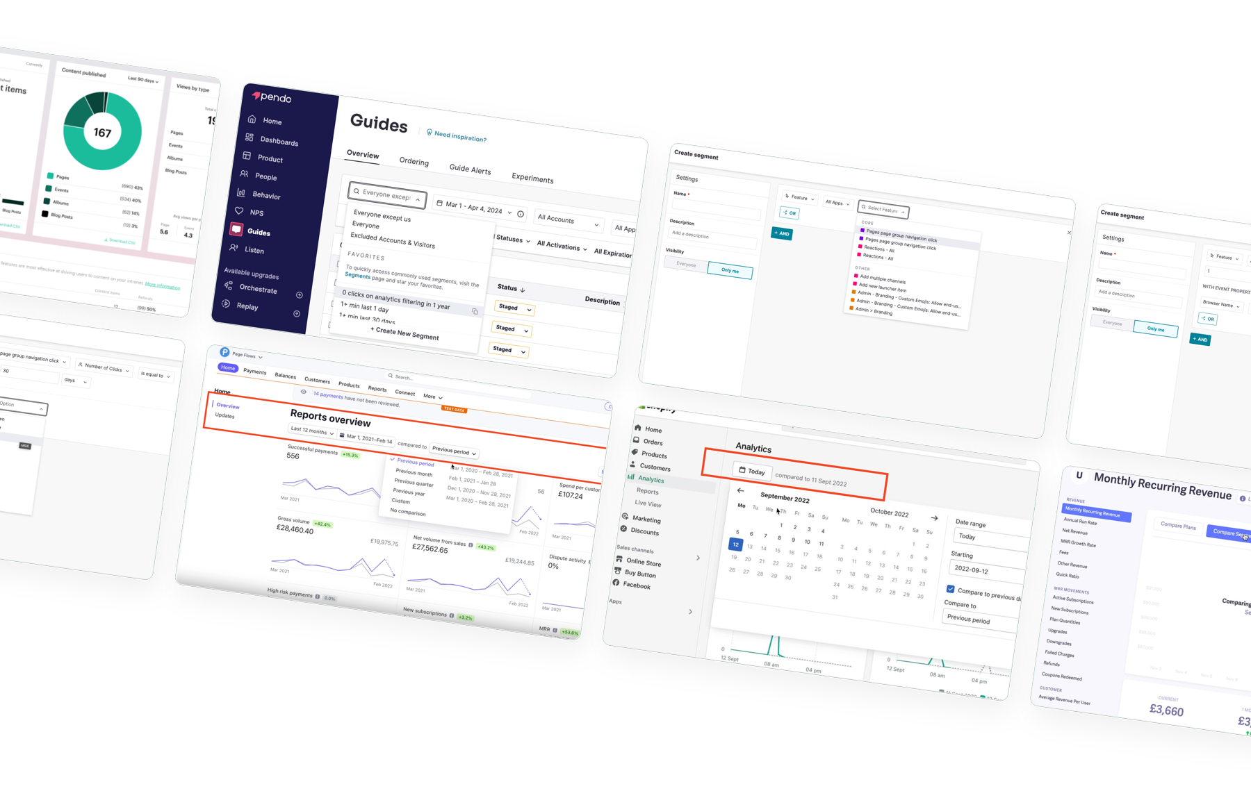
Competitive Analysis
How leading analytics tools handle filtering
Before designing, I audited how tools like Amplitude, Mixpanel, Tableau, and Google Analytics approach audience segmentation and filter UX. Three patterns stood out as models worth adapting for Happeo's context.
Composable audience filters
Top tools let users build filters using multiple AND/OR conditions, not just a single dropdown. This multi-condition model became our blueprint for the segment builder.
Persistent filter state
Amplitude and Mixpanel remember your last applied filter and allow saved views. This pattern directly informed our "save filter" feature, the most requested capability in interviews.
Filter clarity over power
Enterprise analytics tools often expose too many options. The design decision here was to prioritise clarity, showing operators and conditions immediately after selection, not behind extra steps.
Information Architecture
Information Architecture
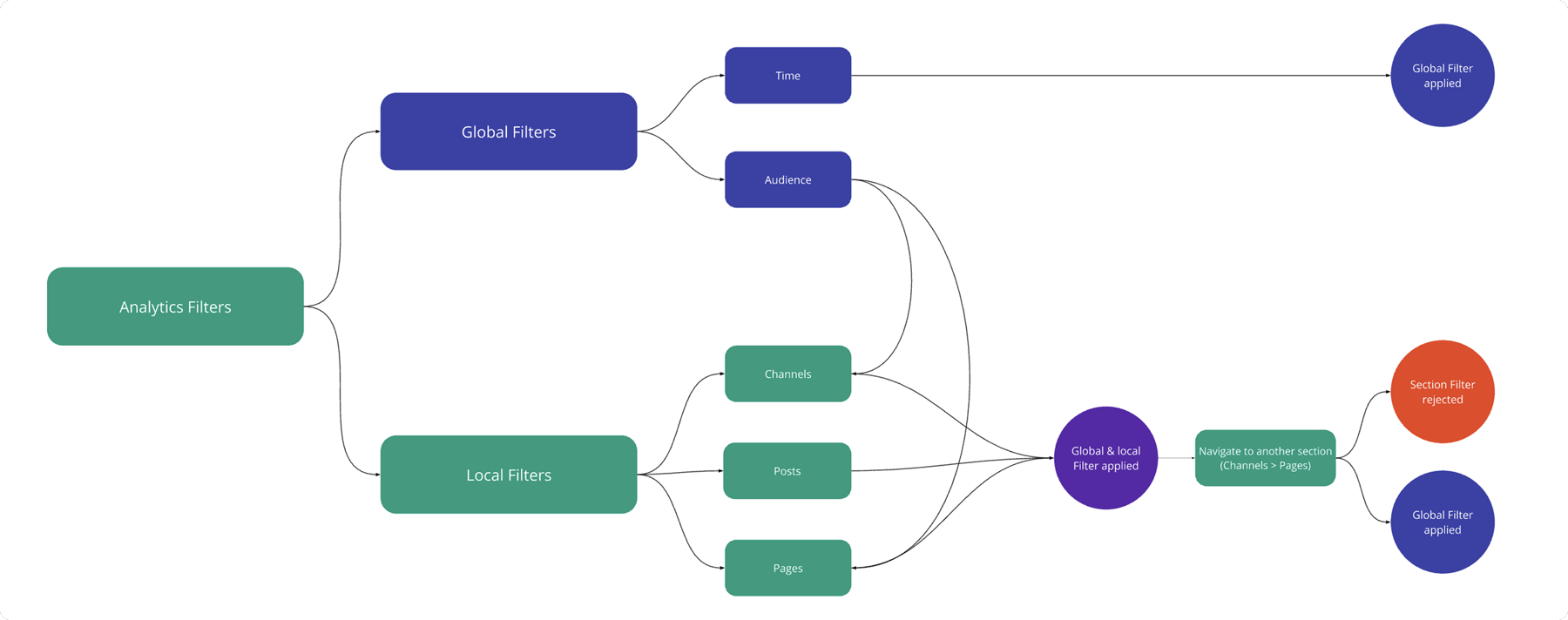
The core architectural decision was separating global audience filters, which apply across the entire analytics dashboard, from section-level filters that scope to a single surface like Channels or Posts. This distinction mattered because they serve different intent: audience filters answer "who is engaged?", section filters answer "what content or channel is performing?". Conflating them into one pattern would have created a system that was more powerful on paper but harder to reason about in practice. The save/load filter model was built to work consistently across all three surfaces, so admins could build reusable views regardless of which surface they started from.
Usability Testing
First iteration, what changed and why
The first round of Maze testing revealed that users found the overall concept intuitive, but the condition selection step created friction, too many clicks, unclear state changes. We simplified the filter interface: auto-displaying condition options on load, reducing the filter creation flow from 5 steps to 3, and making operators visible immediately after selection rather than requiring an extra confirmation.
Maze Findings
What the testing uncovered, and how we responded
Despite high overall satisfaction, Maze sessions surfaced three specific friction points that would have caused real-world failure if shipped unchanged. Each finding had a direct design response.
Condition selection caused misclicks
The condition selection page required users to make a choice before any options were visible, leading to hesitation, wrong taps, and backtracking. It accounted for the majority of failed task attempts.
↳ Fixed: Auto-display condition options on page load; removed the extra confirmation step.
Operators weren't visible until too late
Users had to apply a condition before seeing what operators (e.g. "is", "is not", "contains") were available, making it hard to understand the system's logic before committing.
↳ Fixed: Show operator options immediately after condition selection, in the same step.
Filter removal was confusing
The "remove filter" affordance used a small close icon that was easy to miss. Users were unsure if removing a condition also removed the filter, leading to hesitation and repeated errors.
↳ Fixed: Added a dedicated "Remove Filter" button with a clear label and confirmation state.
Overall sentiment was positive
Despite the friction points, all participants rated advanced filtering as a meaningful improvement. The issues were interaction-layer bugs, not conceptual problems, giving us high confidence the direction was right.
Test Results
Usability results, second iteration
After applying the iteration fixes, scores improved across all three tracked dimensions. The 100% task success on filter creation, the primary test scenario, confirmed the simplified flow was working.
8.5Ease of use, 8.5/10. Users consistently described the redesigned filter creation as "quick" and "logical".
7.9Meets expectations, 7.9/10. Strong alignment with what enterprise admins said they needed during the research phase.
100%Task success rate. Every participant successfully created and applied an audience filter on the first attempt. No retries.
Final Design
The shipped filter experience
Three design decisions shaped the final experience: (1) conditions display on load, no extra tap to reveal options; (2) operators show inline immediately after condition selection, no back-and-forth; (3) a persistent "Active filters" summary bar gives admins a constant view of what's applied. The result is a filter flow that enterprise power users can complete in under 20 seconds.
Impact
Post-launch impact
Six weeks after release, usage data confirmed that advanced filters were delivering real value, but adoption was concentrated in the right accounts: enterprise customers with complex org structures who needed segmentation most.
10× higher filter usage in enterprise
Organisations like Randstad and Givaudan use filters 10× more than SMB accounts, and show 9% engagement vs 5.5% average. The feature was built for enterprise, and enterprise used it.
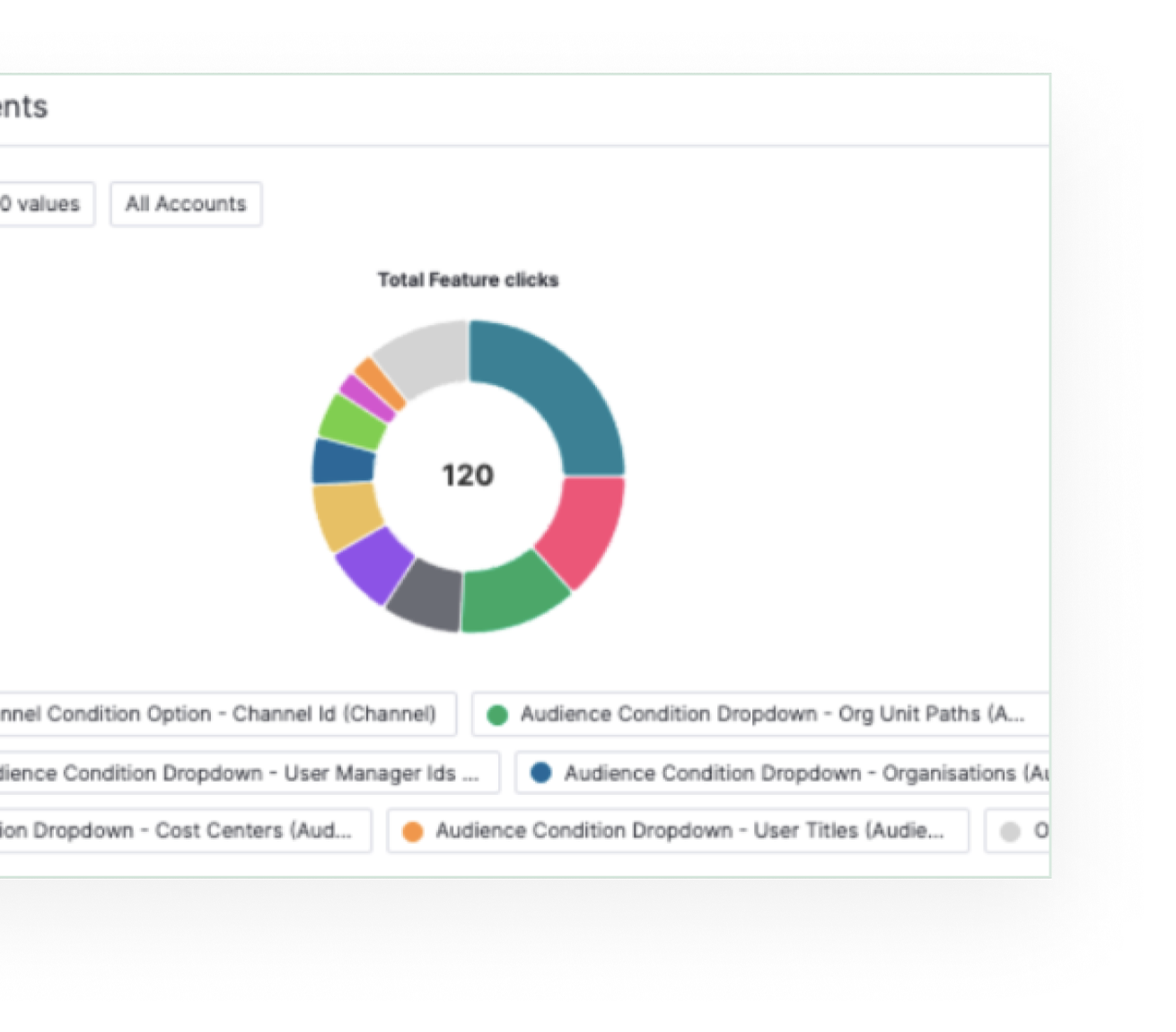
Department filter = 25% of all activity
The single most-used filter was department segmentation, directly validating the research finding that admins primarily want to understand which teams are actually engaged.
Adopted alongside basic filters
Advanced filters were primarily used by admins who had already adopted standard date filtering, not as a first touchpoint, but as a natural step-up for power users.
7% of admins applying audience filters
17% of all admins actively used analytics post-launch, and 7% were applying audience filters, a meaningful cohort given enterprise account sizes of 5,000–46,000 employees.
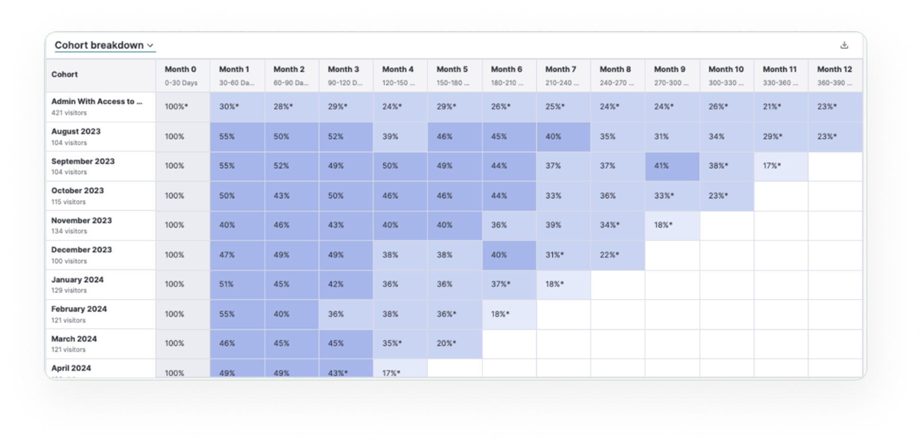
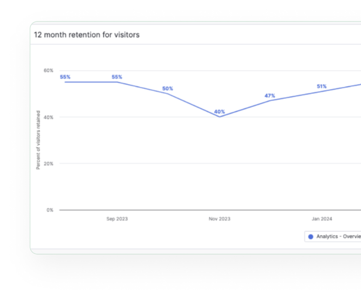
30–40% analytics session retention
Analytics retained 30–40% of users across sessions, a strong signal that the data was meaningful enough to revisit, particularly for teams tracking weekly engagement cycles.
Conclusion
What this project reinforced about enterprise product design
Advanced filters delivered clear value for enterprise accounts, but adoption data also revealed something important: most customers don't filter at all, because they never had a reason to. A future direction worth pursuing is an analytics overview that surfaces key insights by default, so every admin, not just power users, gets value without needing to configure anything.
The project taught me to hold two truths at once: the feature worked well for its intended users, and it revealed a bigger opportunity around making analytics more accessible to everyone. Both are worth acting on. Thanks to PM James Dashwood, the engineering squad, and Mahdi for early design groundwork that shaped the direction.