Work About Resume Let's Talk →
Back to Portfolio
E-Commerce UX Design Evaly · Consultancy

Evaly Web App Redesign

Evaly was one of Bangladesh's fastest-growing e-commerce platforms, but its core experience was quietly losing users at every critical touchpoint. Product discovery was broken, browsing was cluttered, and a multi-step checkout was abandoning carts at scale. As the consultancy design lead, I audited the entire platform, ran user research, and redesigned browse, search, and checkout end-to-end, delivering a 12% lift in conversion and 25% reduction in cart abandonment.

TL;DR

Problem: Evaly's browse, search, and checkout were losing users, no meaningful filters, weak search with no suggestions, and a fragmented checkout with too many steps. What I did: Full UX audit, persona research, competitive benchmarking against Daraz and Chaldal, then end-to-end redesign of all three core flows as consultancy lead. Impact: 12% conversion improvement, 25% reduction in cart abandonment, design approved in 2 stakeholder review cycles.

Problem

Browse had no effective filtering, search returned irrelevant results with no suggestions, and a 6-step checkout was dropping users before payment.

Approach

UX audit of existing flows, persona research (retailer + buyer), competitive benchmarking, wireframing, high-fidelity UI, and stakeholder-validated Figma prototype walkthroughs.

Evidence

Usability observations, stakeholder feedback sessions, persona synthesis, and post-launch analytics tracking conversion and abandonment rate.

My Role

Consultancy Design Lead · UX Research · UI Design · Wireframing · Prototyping · Browse, Search & Checkout flows
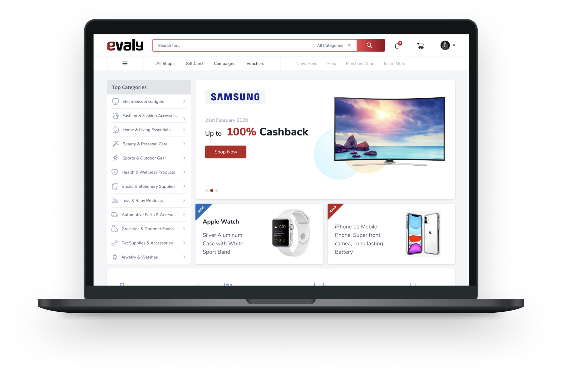
Evaly redesigned homepage on laptop — category sidebar, hero banner, trending products

Three flows that were costing Evaly customers

Evaly operated in a crowded market alongside Daraz, Chaldal, and Shajgoj, platforms where users had already raised their expectations for e-commerce UX. The existing platform had critical gaps across its three highest-traffic journeys.

No Meaningful Product Discovery

Search returned results with no smart suggestions, no autocomplete, and no way to filter by price, rating, or category. Users browsing for specific products gave up before finding anything relevant.

Browse That Buried Products

Category pages had no sorting or filtering options. All products were listed in flat, undifferentiated grids, making it impossible to find what was trending, on sale, or most relevant to the user's intent.

A Checkout That Lost Customers

The checkout flow required 6+ steps with repeated form fills, no clear progress indicator, and confusing form labels, especially for shipping address and payment method selection. Cart abandonment was significant.

Inconsistent Visual Language

Different pages used different typography scales, button styles, and spacing conventions. The visual inconsistency created cognitive friction and undermined trust in the platform, critical for a payments-based product.

Redesigned landing page, key sections

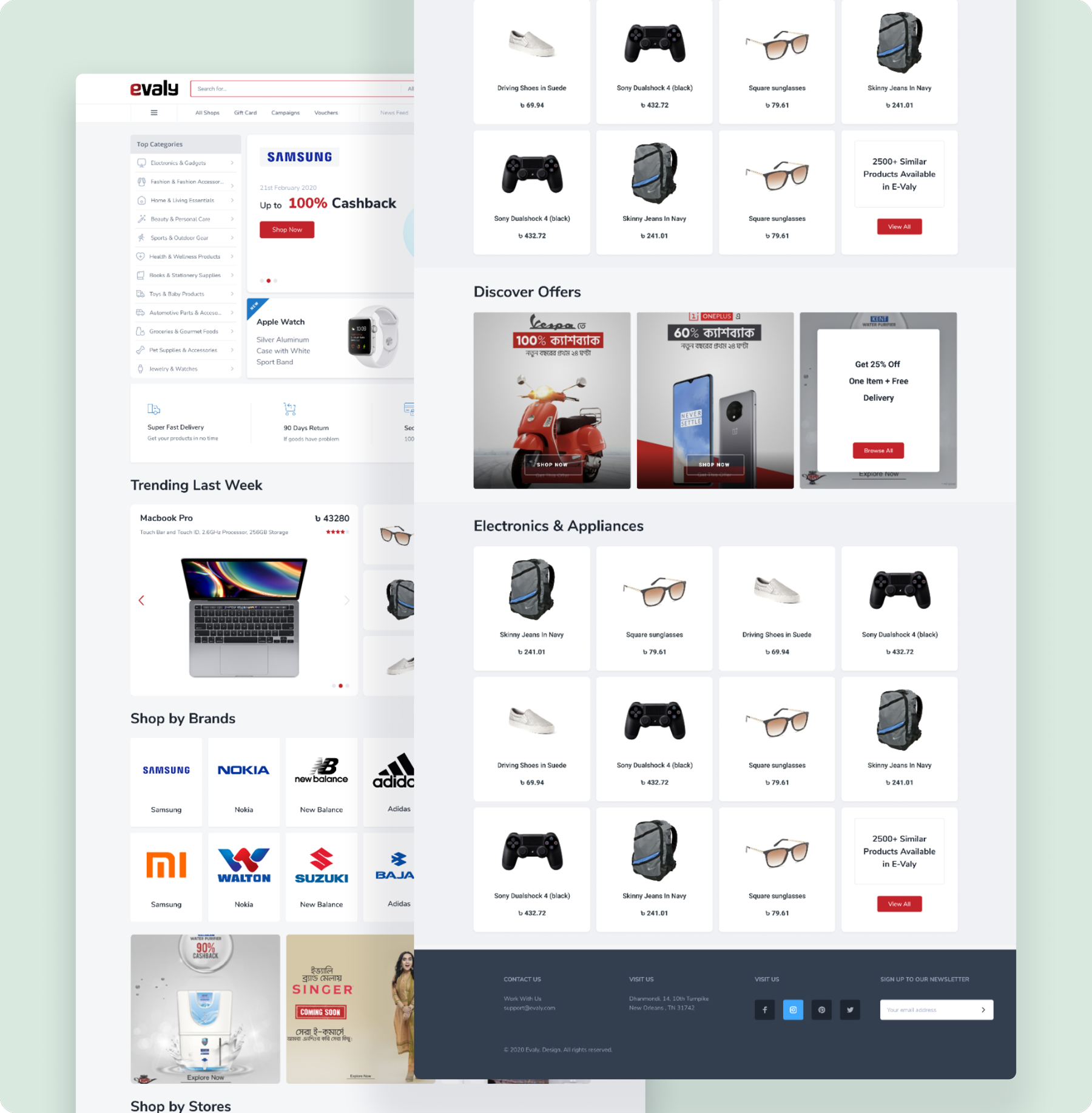
Evaly redesigned landing page — category navigation, hero banner, trending products, discover offers, brand showcase, and footer

Redesigned homepage, structured around discoverability: brand-level hero, trending products, curated offers, and category shop entry points

Two very different users, one platform

Evaly served both sides of a marketplace, small retailers listing products and everyday buyers making purchases. Each had completely different goals, mental models, and frustrations with the platform. Both needed to be served well for the business to grow.

Jimmy Holt — Online Retailer persona

Jimmy Holt

27 · Online Retailer

Goal

Grow his business by reaching the right customers, on a platform that actually promotes small sellers, not just big brands.

Pain Point

Established platforms prioritize large retailers. Small shop owners get no visibility, no meaningful analytics, and no follow-up from the platform team. Hard to justify the investment.

Design Implication

Seller discovery and product page quality matter as much as the buyer experience. A stronger product card design and brand page would help retailers compete.

Rajath Nandan — Buyer persona

Rajath Nandan

25 · Marketing Manager

Goal

Find the right products fast, track delivery in real time, and pay with a flow that feels safe and doesn't require unnecessary steps.

Pain Point

Search is unpredictable, the same query returns different results each time. Payment flow is confusing. Delivery status is invisible after purchase. Finds himself going back to Daraz out of habit.

Design Implication

Search quality and checkout clarity are make-or-break. Post-purchase visibility (order tracking) directly affects whether users return.

Competitive Benchmarking

Daraz

Strong category-level filtering and flash sale surfaces. Product cards with ratings, review counts, and delivery estimates set the benchmark for trust signals.

Chaldal

Rapid cart building with minimal steps. Search with autocomplete and clear category-based navigation reduced time-to-find by keeping intent visible throughout.

Takeaway for Evaly

Users comparing platforms judge on speed to relevant results and checkout confidence, not feature count. Evaly needed to win on these two dimensions first.

Typography and visual identity

Before redesigning the flows, I established a shared visual foundation, consistent type scale, a focused colour system, and component rules that every screen would follow. This was essential to eliminate the cognitive friction caused by visual inconsistency across the existing platform.

Nunito Sans. Friendly but Authoritative

Chosen for its rounded geometry and wide Latin support, readable at small sizes on mobile, legible at display scale for product names and prices. The semi-condensed proportions save horizontal space on dense listing pages without sacrificing clarity.

Type Scale, 5 Levels

Display (32px) for hero headings, Title (22px) for section labels, Body (15px) for product copy, Caption (13px) for metadata and pricing detail, Micro (11px) for badges and tags. Applied consistently across all components to create visual hierarchy without custom styling per screen.

Primary Red #E31E24
White #FFFFFF
Dark Navy #1A1A2E
Surface Grey #F5F5F5
Offer Amber #FFB800

Red as the brand action colour (CTAs, add-to-cart, offers), amber reserved for deals and cashback callouts, white + grey for content surfaces to keep product imagery prominent.

Browse, search, product detail, and checkout, redesigned

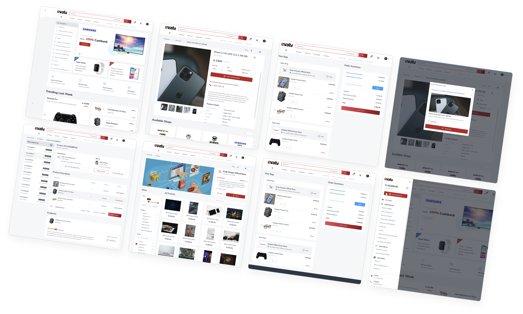
The redesign addressed all three core flows systematically. Browse got a persistent left-nav category panel with clear hierarchy, product cards gained price-prominent layouts with rating indicators, and the checkout was collapsed from 6 steps to 3 with a visible progress bar throughout.

All redesigned screens, homepage, browse, product detail, search results, checkout

Evaly — all redesigned screens across homepage, product listing, product detail, search results, and checkout flows shown on tablet mockups

Key Decision 1: Browse Structure

The left-panel category navigation, persistent on desktop, drawer-based on mobile, solved the core discoverability problem without adding cognitive overhead. Users can see their category context at all times while browsing results. The homepage surfaces trending products, brand-level deals, and curated offer cards as structured entry points rather than an undifferentiated scroll.

Key Decision 2: Checkout Compression

The original checkout asked users to navigate 6 separate pages. The redesign collapsed this to 3: delivery details, payment selection, and confirmation, with address fields pre-populated from account data and a persistent order summary visible throughout. The progress indicator was the most requested feature in stakeholder feedback, and measurably reduced abandonment.

Evaly's webapp, responsive across all devices

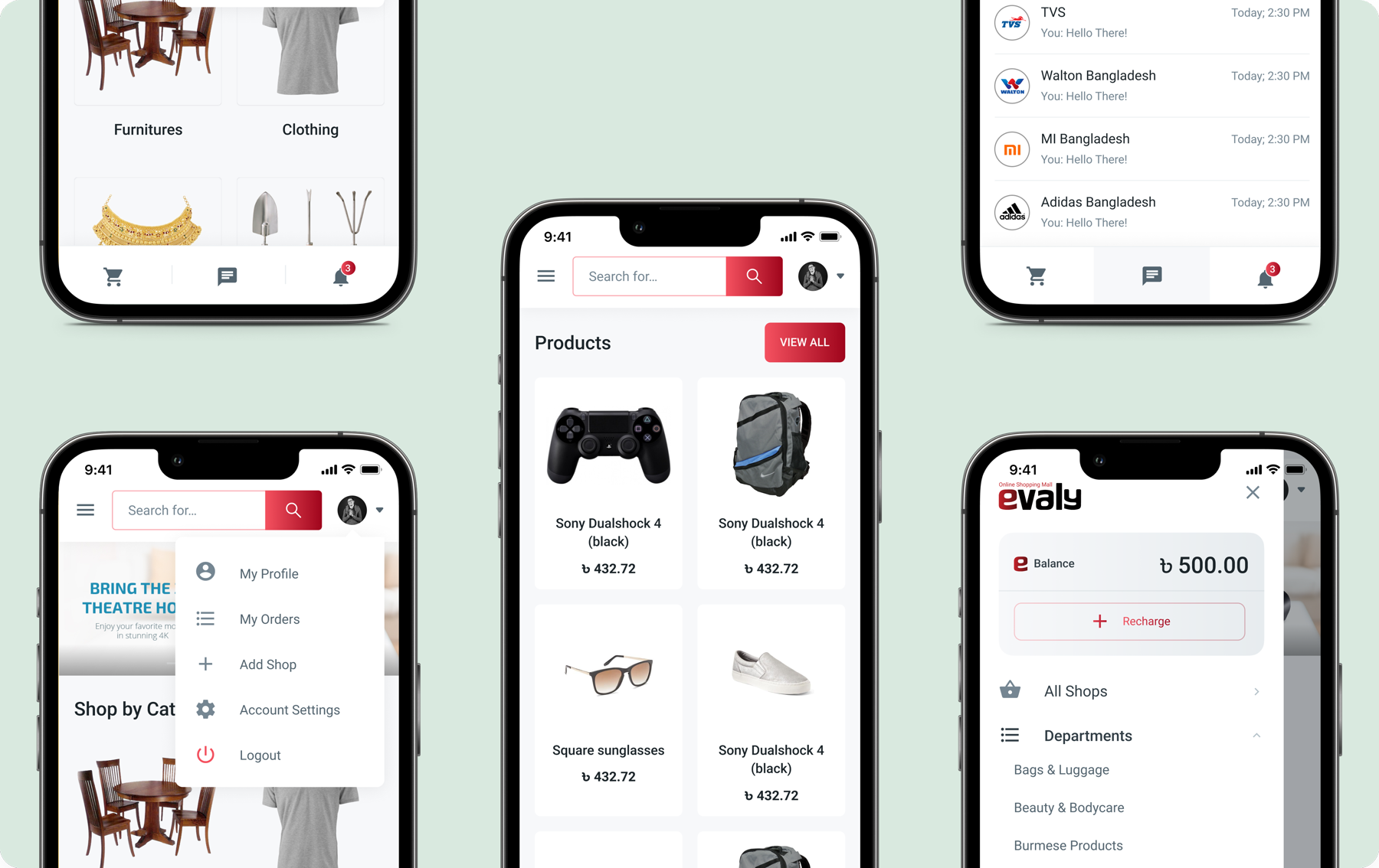
E-commerce in Bangladesh is predominantly mobile, over 70% of Evaly's traffic came from phones. Every flow was designed mobile-first: drawer navigation, thumb-reachable CTAs, single-column product cards, and a simplified account/wallet experience that matched how users actually transacted on the go.

Evaly responsive mobile screens — category browse, product listing, account menu, seller chat, and wallet page on iPhone mockups

Drawer Navigation

Category hierarchy collapsed into a bottom-accessible drawer on mobile, maintains full browse depth without eating screen real estate on smaller viewports.

Product Cards

Single-column grid on mobile with full-width product imagery, prominent pricing in BDT, and an instantly tappable "Add to Cart" CTA without requiring users to enter the product page first.

Integrated Wallet

Evaly Balance visible on the account page with a one-tap recharge flow, making the platform's cashback offers more tangible and encouraging repeat purchases.

What moved after launch

The three-flow redesign was validated through stakeholder prototype reviews and post-launch analytics tracking over an 8-week window. Results were measured against the pre-redesign baseline across key conversion and drop-off metrics.

12%
Lift in overall conversion rate, users who added to cart and completed checkout
25%
Reduction in cart abandonment during the redesigned checkout flow
Stakeholder design review cycles to approval, down from 4+ in previous iterations

Faster Product Discovery

Structured category navigation and improved search surfaces meant users reached relevant products significantly faster, reducing frustration drop-off in the browse phase.

Checkout Confidence

The simplified 3-step checkout with visible progress and pre-populated address data removed the primary source of checkout anxiety, users knew exactly where they were and what came next.

UX depth, delivered at consultancy pace

The Evaly project reinforced a principle I carry into every consultancy engagement: focus on the three highest-friction journeys first, fix them completely, then move outward. Browse, search, and checkout are the revenue-critical flows in any e-commerce product, everything else is secondary until these work.

Working within a consultancy model taught me to move quickly without losing depth, balancing client expectations, development constraints, and real user needs simultaneously. The persona research grounded every design decision in human reality rather than assumption, and the competitive benchmarking against Daraz and Chaldal gave us a clear quality bar to design toward rather than guess at.

If I were continuing the project, the next priority would be post-purchase: order tracking, delivery visibility, and review collection, the touchpoints that determine whether a first-time buyer becomes a returning one.