Pathao Food was Bangladesh's fastest-growing food delivery platform, but the ordering experience was losing users at three critical points: menu browsing, item selection, and checkout. I led the end-to-end redesign, from audit through to shipped UI, improving order completion by 10% and driving measurable uplift in cart additions through item-level food photography.
TL;DR
Problem: Confusing menu navigation, no item images, and a broken checkout flow were creating drop-off and failed orders. What I did: Full redesign of restaurant browsing, menu UX, repeat order flow, and checkout, including introducing item-level imagery and a sticky reorder panel. Impact: 10% uplift in order completion. Measurably higher cart additions for items with photos. Adopted by millions of users in Bangladesh.
Three high-friction points, no item images, dead-end menu navigation, and a confusing checkout, were causing order abandonment and failed completions across millions of users in Bangladesh.
Design audit → competitive analysis → wireframe exploration → high-fidelity prototype → usability testing → post-launch measurement with Pendo. 8 tracked metrics defined upfront.
UX research with Abu Shahed (UX Researcher), prototype usability sessions, 8 success metrics tracked in Pendo, post-launch order completion and cart addition data.
Led end-to-end: problem identification, wireframing, UI design, prototype testing, impact analysis. Collaborated with UX Research and the PM team on metric definition and release.
Problem
Pendo analytics and user research with Abu Shahed (UX Researcher) identified three distinct points where users were abandoning the flow, and a shared root cause: the interface wasn't giving users enough confidence to commit to an order.
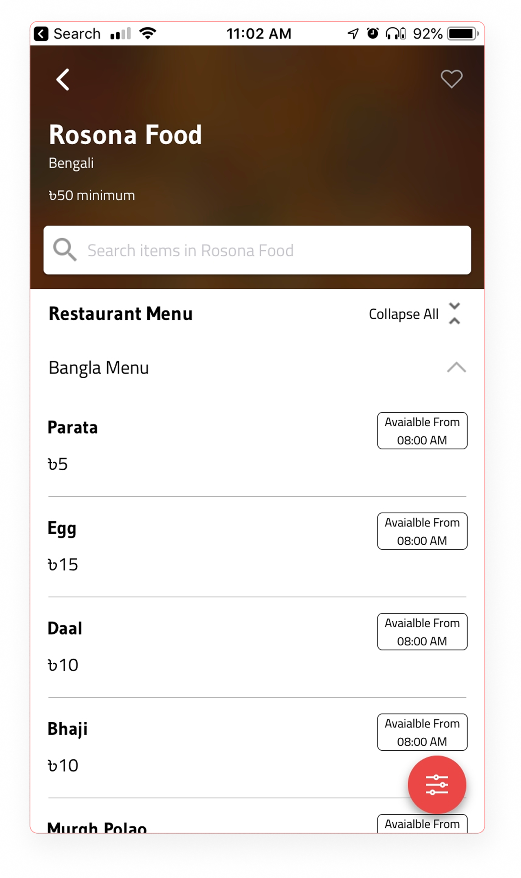
Most menu items had no photos, users couldn't see what they were ordering. This was the single biggest driver of browse abandonment, especially for new items and restaurants.
Category navigation required users to scroll to the top to collapse a section before opening another. On long menus, this felt like a loop, users gave up rather than dig through sections manually.
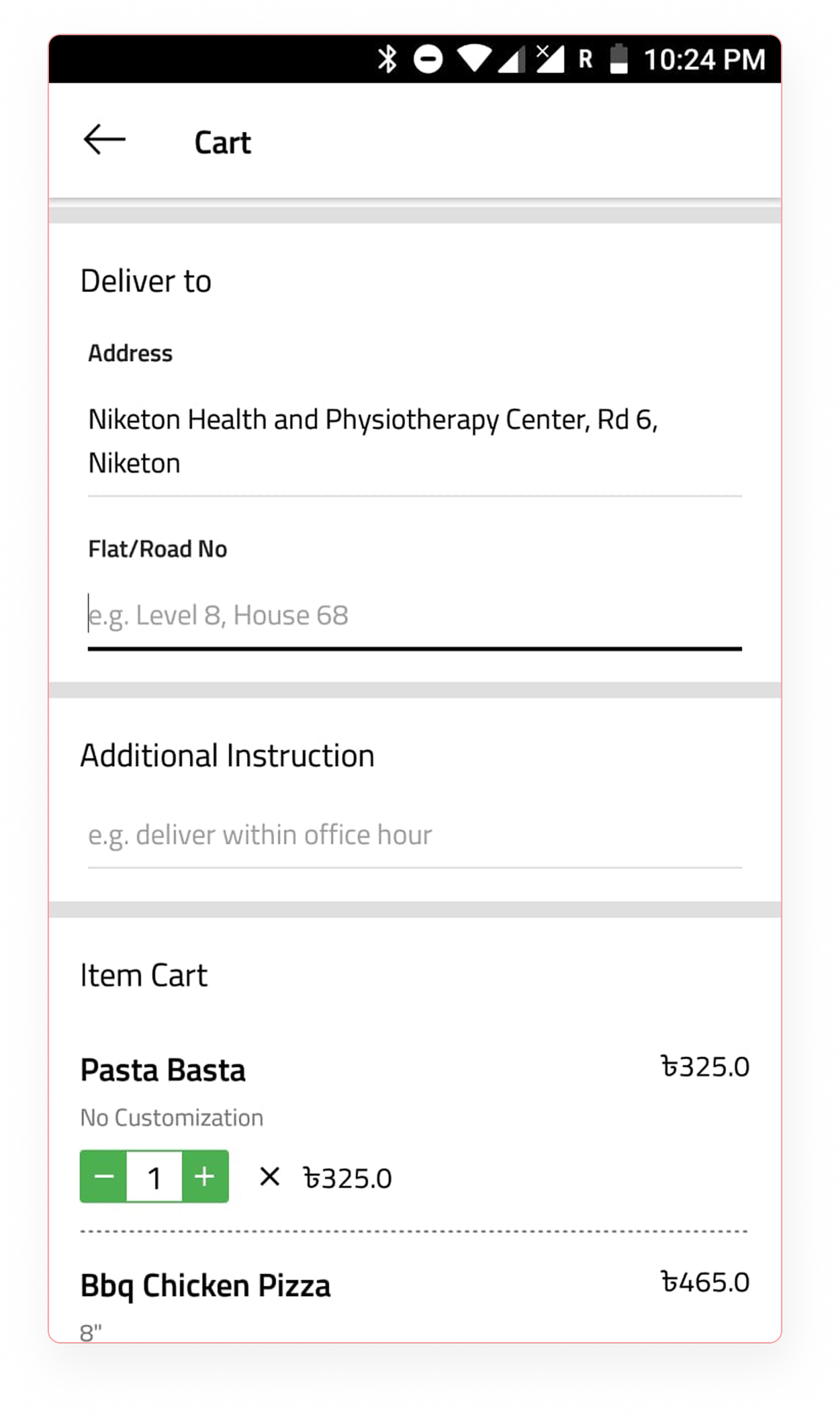
The order confirmation screen had unclear totals, a hidden delivery location field, and an address entry UI that confused users, causing hesitation and failed orders right at the point of purchase.
Design Audit
A systematic review of the existing interface revealed four key problem areas causing the most friction.
Poor visual contrast made key elements hard to distinguish. Cluttered category navigation required users to scroll back to the top to collapse sections, and the filter option was often overlooked.
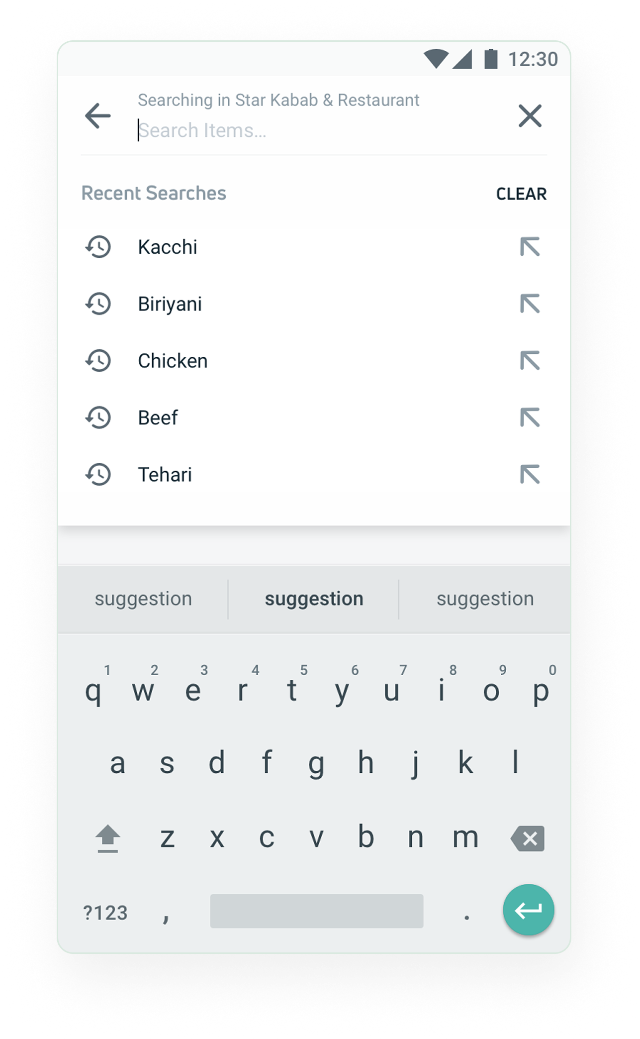
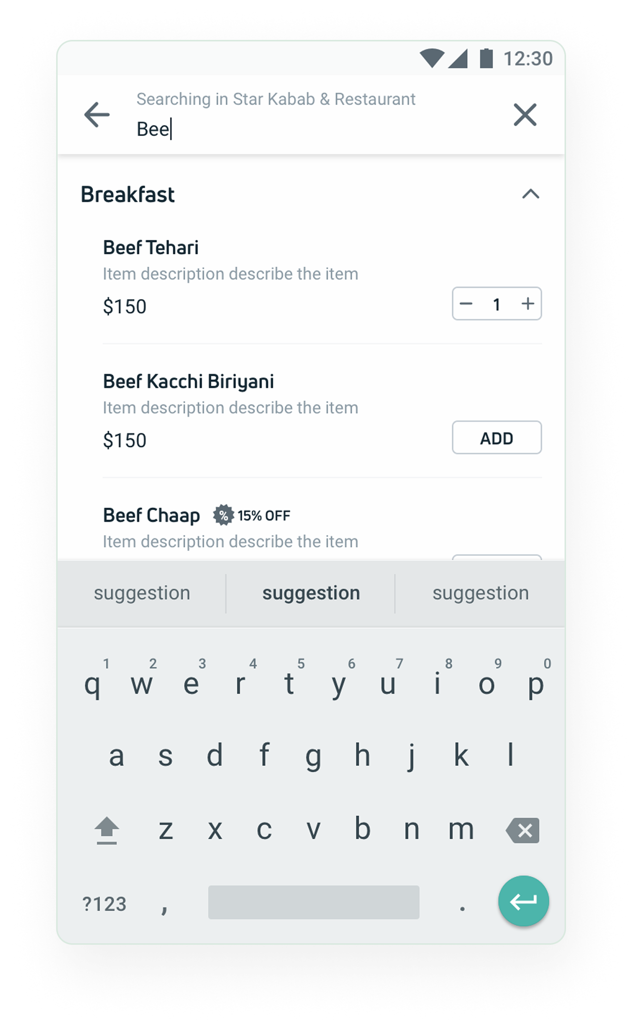
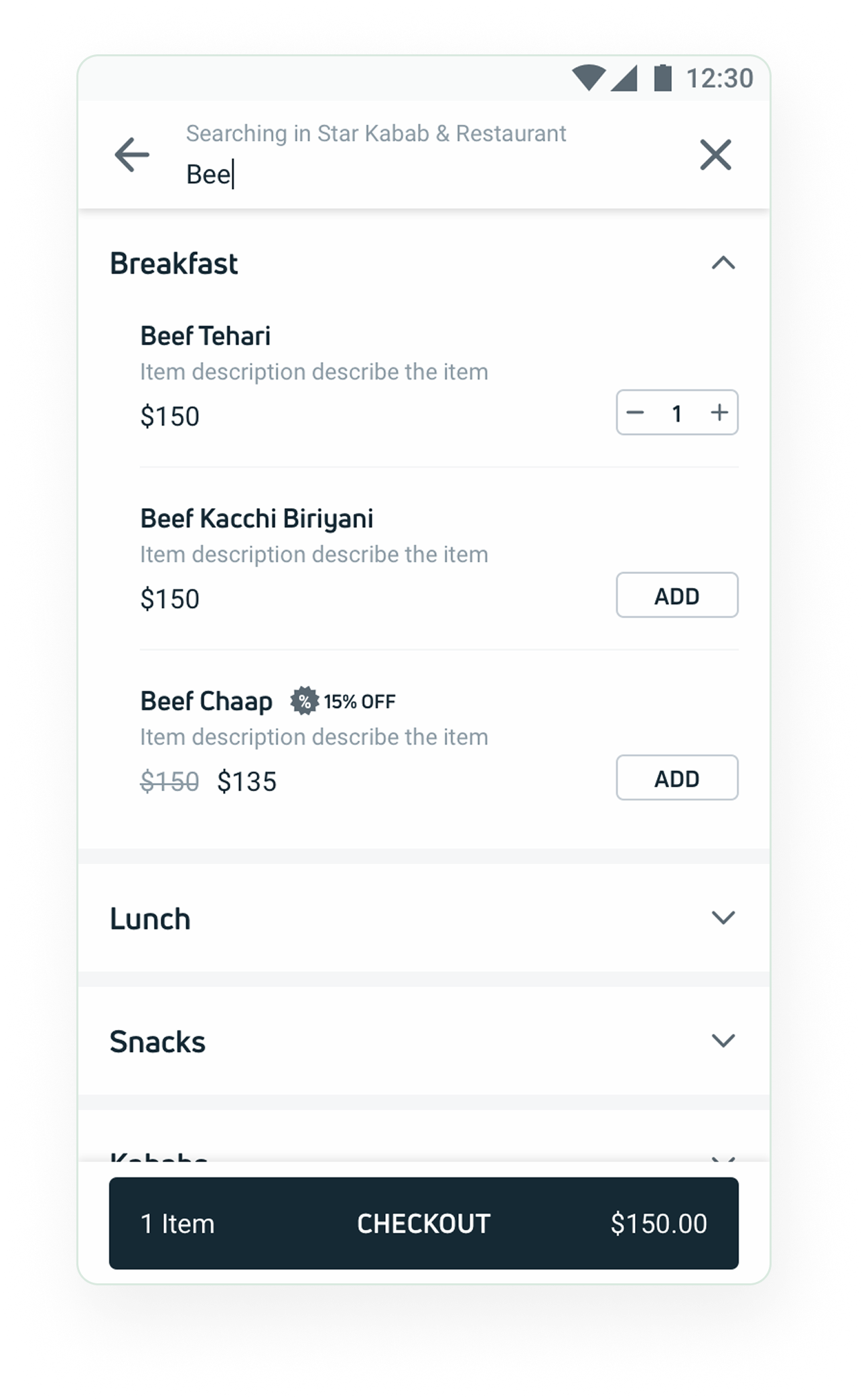
The search screen didn't optimise screen space, discounts had unclear badge placement, and the "View Cart" label confused users. Notifications about order availability came too late.
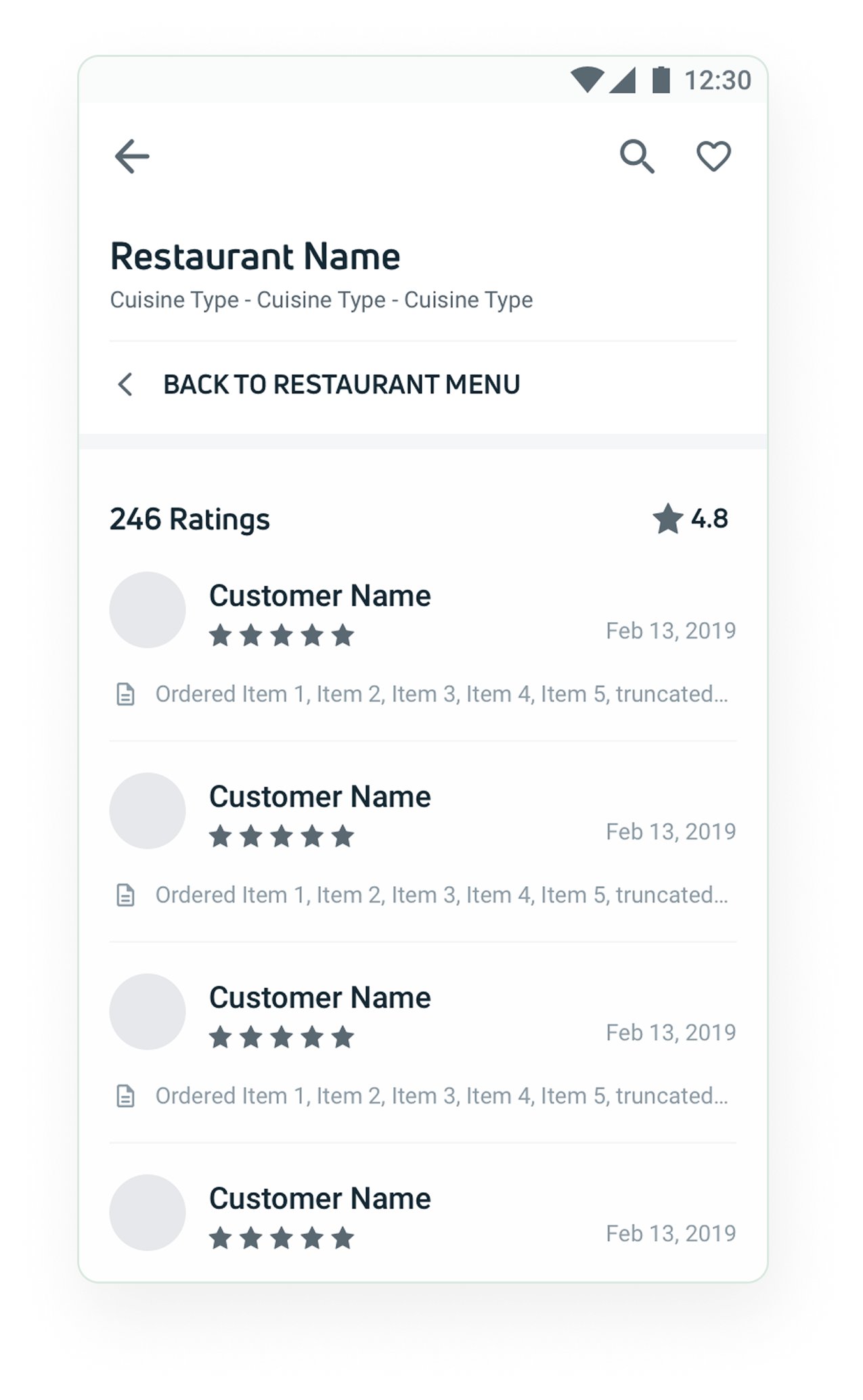
The review section lacked design consistency, and ordered items were not shown with reviews, making it hard for users to connect feedback to their orders.
Address fields were unclear, the delivery location map feature was hidden, and the confirmation flow lacked polish, leading to confusion during checkout.
Wireframes
We wireframed all eight core screens before moving to high-fidelity, validating navigation patterns, information hierarchy, and interaction models with the team. Key questions we were testing: does tab navigation work for long menus? Does the repeat order panel live above or below the fold? Is the sticky cart visible enough without blocking content?


Success Metrics
Working with the PM and data team, we established 8 measurable success criteria across three strategic goals, giving us a clear before/after view of the redesign's real-world impact.
Set baseline data for all 8 tracked metrics to create a reliable foundation for future comparison and iteration.
Evaluate each metric against historical benchmarks using Pendo analytics to quantify the real improvement.
Continuously monitor metrics post-launch to catch regressions early and inform the next design iteration.
8 Key Metrics Tracked
% of Increased Orders from Restaurants with Item-Level Pictures
Items with Item-Level Pictures Added to Cart
% of Users Using In-Restaurant Search
% of Users Using In-Restaurant Filter
% of Users Using Jump to Menu Feature
% of Users Tapping on Delivery Location Field
% of Orders with Flat/Road No. Field Populated
Items Without Item-Level Pictures Added to Cart (comparison baseline)
Key Design Decisions
A deliberate shift, red created urgency and pressure, which felt wrong for a browsing-first context. Green tested better for perceived freshness and food quality. This wasn't aesthetic preference; it was grounded in what the brand needed to communicate to build ordering confidence.
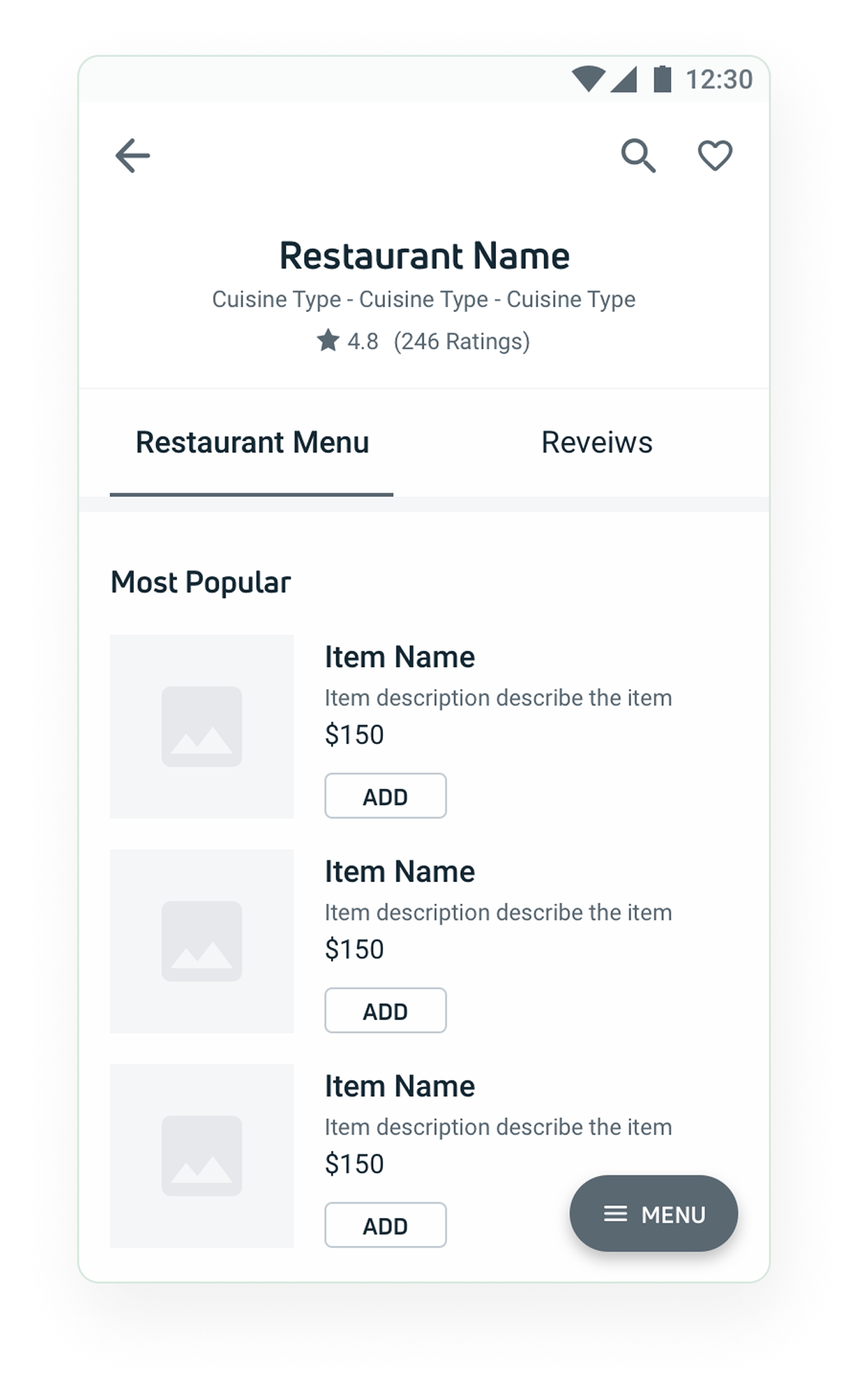
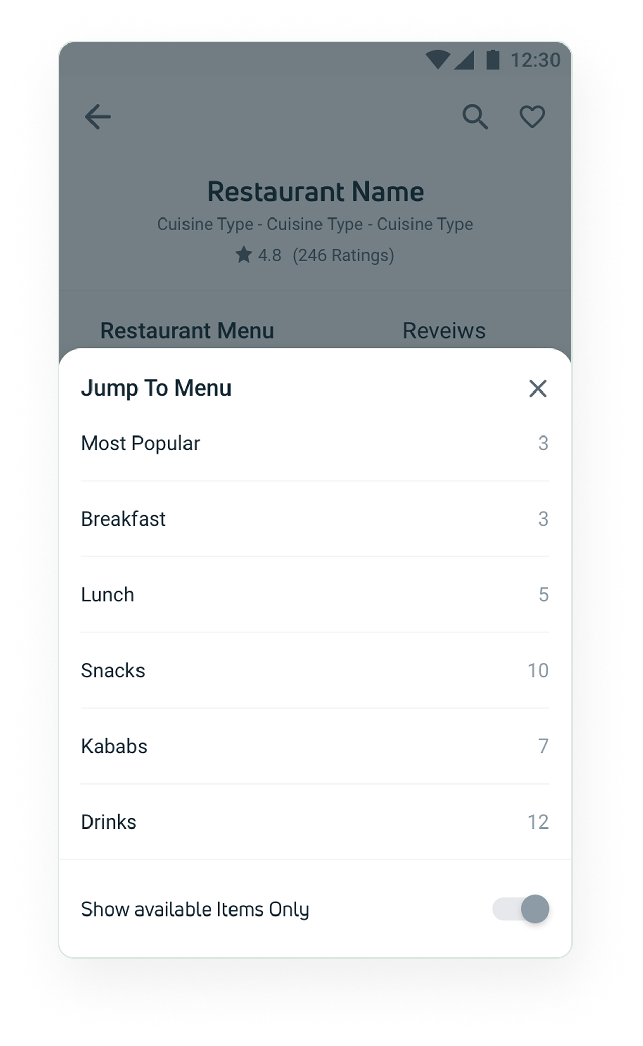
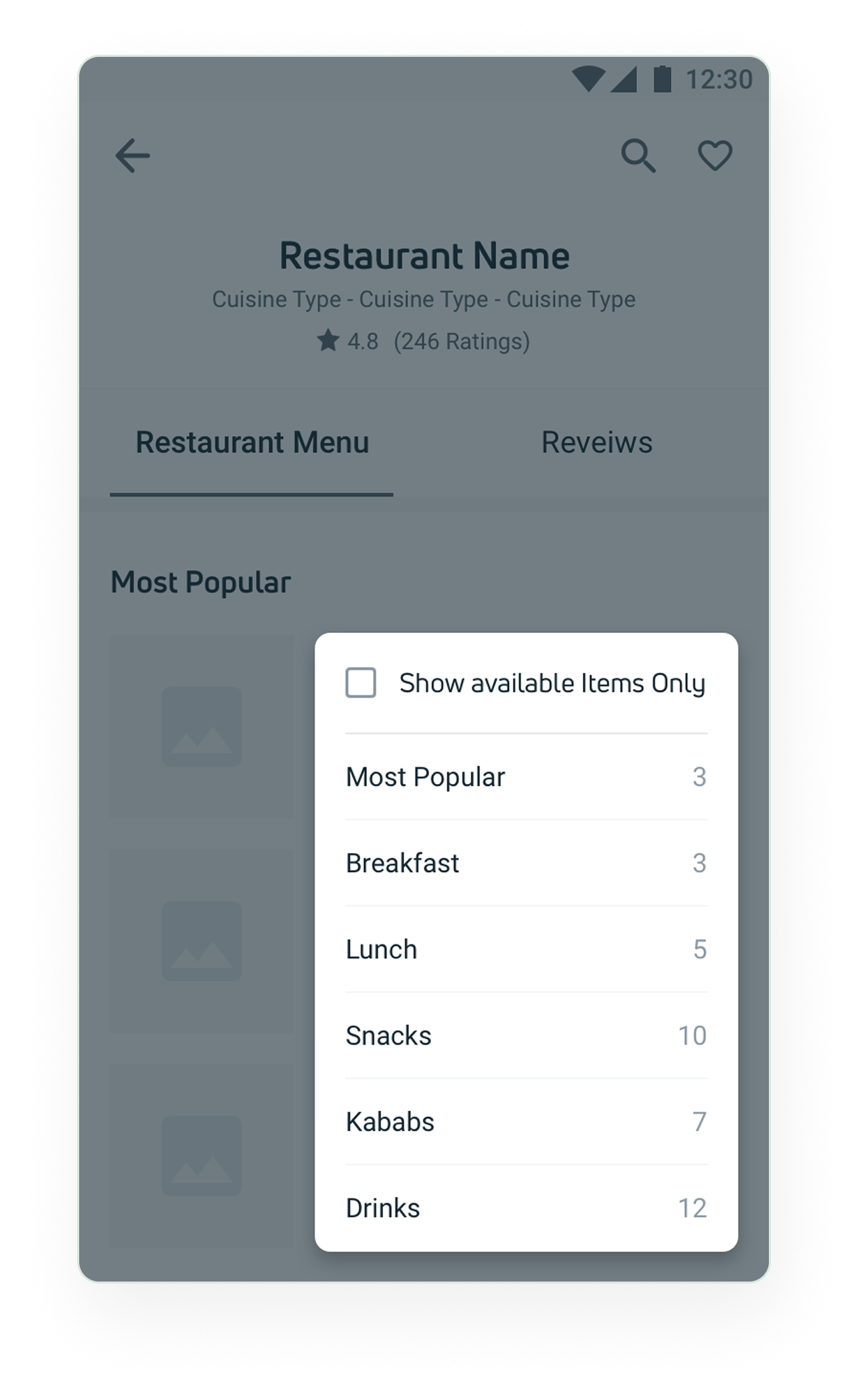
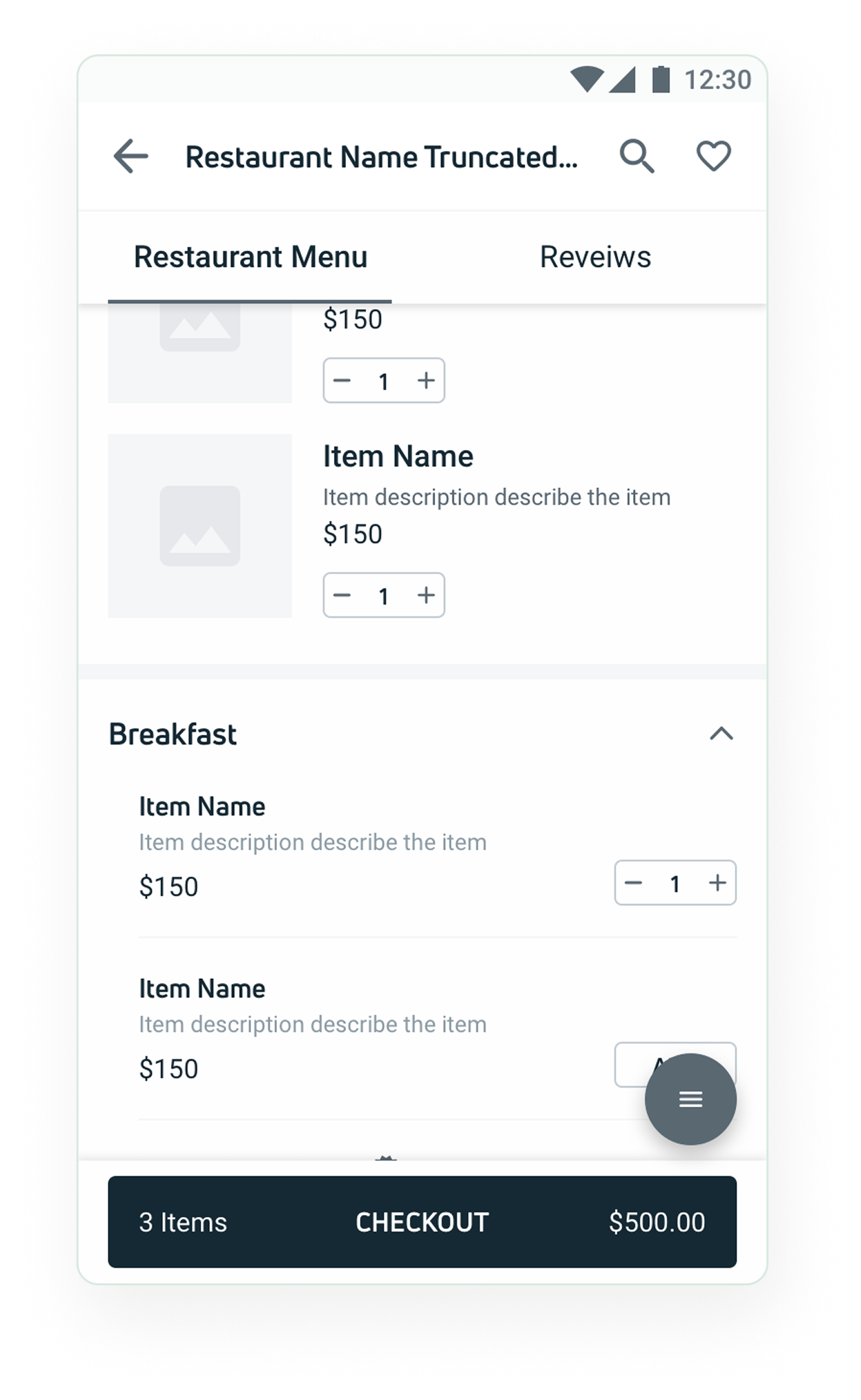
Category tabs now jump directly to the relevant menu section and stay sticky as users scroll. The old pattern required scrolling all the way back up to collapse sections, a meaningful friction point on long menus that the new tab model eliminated entirely.
This was the highest-confidence decision: every item that could show a photo, would. The data later confirmed it was also the highest-impact change, items with images had significantly higher cart addition rates. It also influenced Pathao's broader content strategy for restaurant onboarding.
Rather than burying category access in a static header, a floating MENU button gave users access from anywhere in the scroll. The micro-interaction on expand made it discoverable and delightful without adding visual noise to the core menu layout.
Design in Action
Three core interactions redesigned to solve the biggest usability problems, from reordering to browsing with images to finding restaurants quickly.
The redesigned restaurant page surfaces the user's previous order front and centre, making reordering effortless with a single tap. Clear category tabs, item images, and a floating menu button let users navigate the full menu without losing their place.
Adding food photography to every menu item transformed how users browse and decide. Users can now see exactly what they're ordering, leading to higher confidence, fewer cancellations, and significantly more cart additions for items with photos.
The expanded sticky panel lets users scroll through multiple previous orders without leaving the restaurant page. Returning users can compare past orders, pick the right one, and reorder in seconds, keeping the browsing flow completely intact.
Release Impact
Post-launch Pendo analytics confirmed meaningful improvements across all three redesigned flows. The results validated that targeted UX changes, not just visual polish, drive measurable business outcomes.
10%
Improvement in order completion rates, the primary OKR, driven by a clearer checkout flow and better confirmation screen.
↑ Cart
Significant uplift in cart additions for items with item-level pictures versus those without, validating the food photography investment.
↑ Search
Increased usage of in-restaurant search and Jump to Menu within the first release cycle, users adopted the new patterns quickly.
Key Learnings
Item-level imagery had the highest direct correlation with order conversions, a finding that influenced Pathao's broader content strategy for restaurant onboarding. The repeat order feature reduced decision fatigue for returning users and contributed to higher session-to-order rates on subsequent visits.