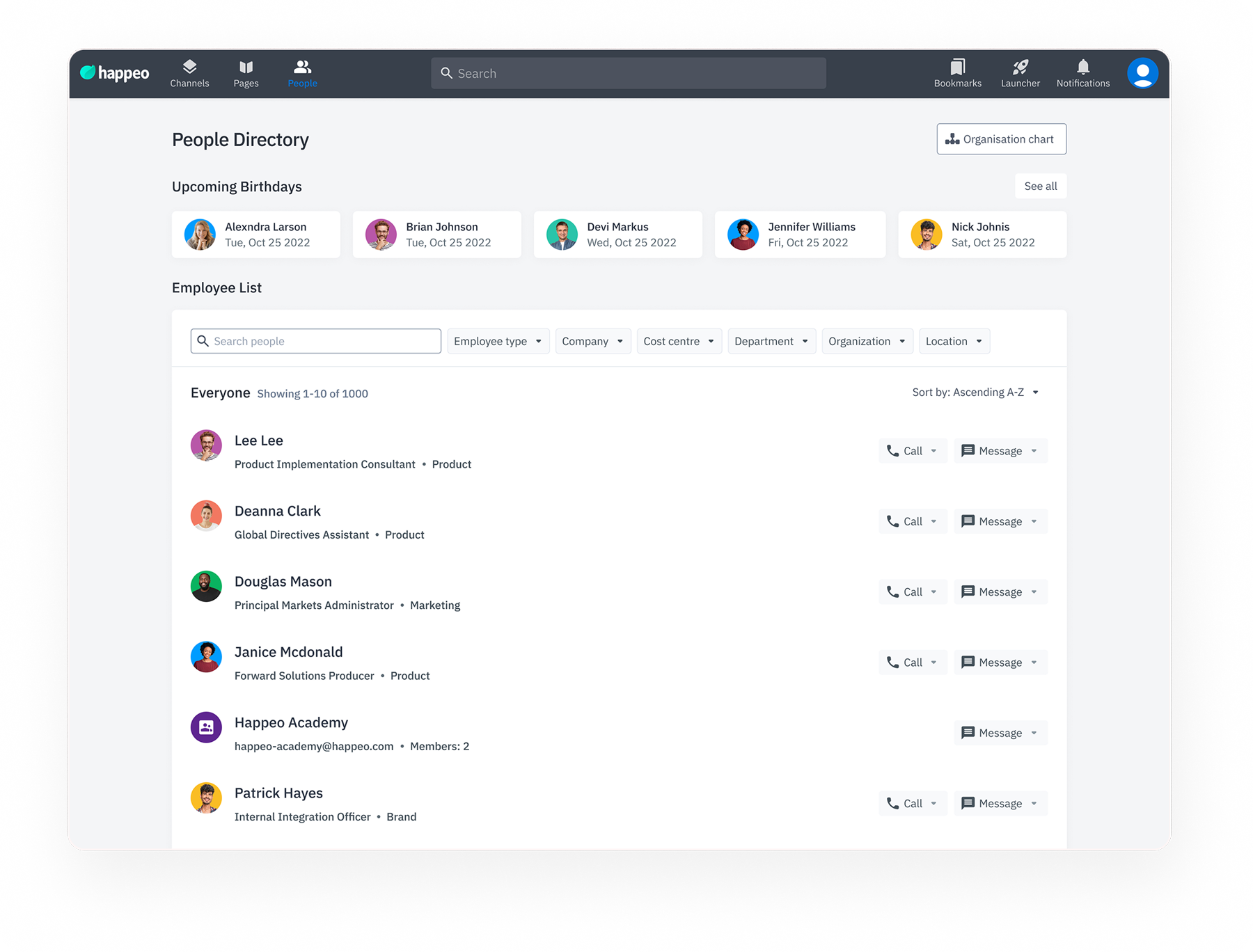
Happeo's People Directory was supposed to help employees find each other, but 78% of users were bypassing it entirely, and 55% didn't even know it existed. I led a full redesign: research, interaction design, and UI. The result was a 70% increase in engagement, a 25% drop in people-finding time, and 100% client satisfaction post-launch.
TL;DR
Problem: Finding a colleague required knowing their exact name. No filtering, minimal profile context, and a layout that didn't scale past 50 people, making the directory useless for large orgs. What I did: User survey (45 users, 12 orgs), UI audit, iterative design with 3 rounds of usability testing, and close collaboration with PM and engineering. Impact: 70% engagement increase, 25% faster people-finding, 40% more directory navigation depth, 100% client satisfaction.
No filtering by department, role, or location. Profile cards showed almost nothing. The layout didn't scale past 50 people. For large enterprises, the directory was functionally useless, and most users had stopped using it.
User survey (45 users, 12 orgs) → UI audit → iterative design → usability testing across 3 org sizes (50, 200, 800+ employees) → PM and engineering collaboration throughout.
45-user survey across 12 organisations, moderated usability sessions with 6 participants, post-launch Happeo engagement analytics tracking session depth, return visits, and filter usage.
End-to-end: research, UX, interaction design, UI redesign, prototyping, usability testing. Collaborated closely with PM on success metric definition and with engineering on technical constraints.
Challenge
In large organisations using Happeo, finding the right colleague, by role, department, or expertise, was unnecessarily hard. The existing people directory lacked meaningful filtering and rich profile context, turning a potential connection tool into a frustration point.
Finding colleagues required knowing their exact name, no filtering by department, role, or location to help narrow the search in large teams.
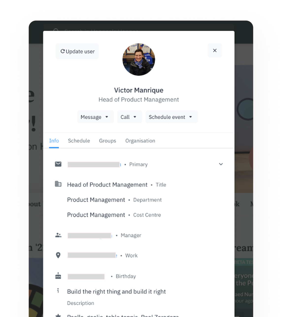
Profile cards showed minimal information, making it difficult to understand a person's role or expertise at a glance before opening their full profile.
Without robust filtering options, employees in large organisations couldn't efficiently narrow down the people they were looking for.
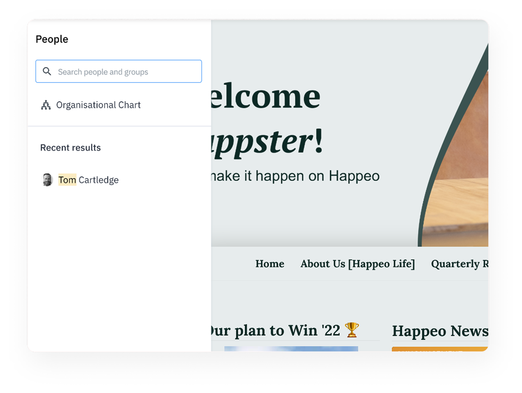
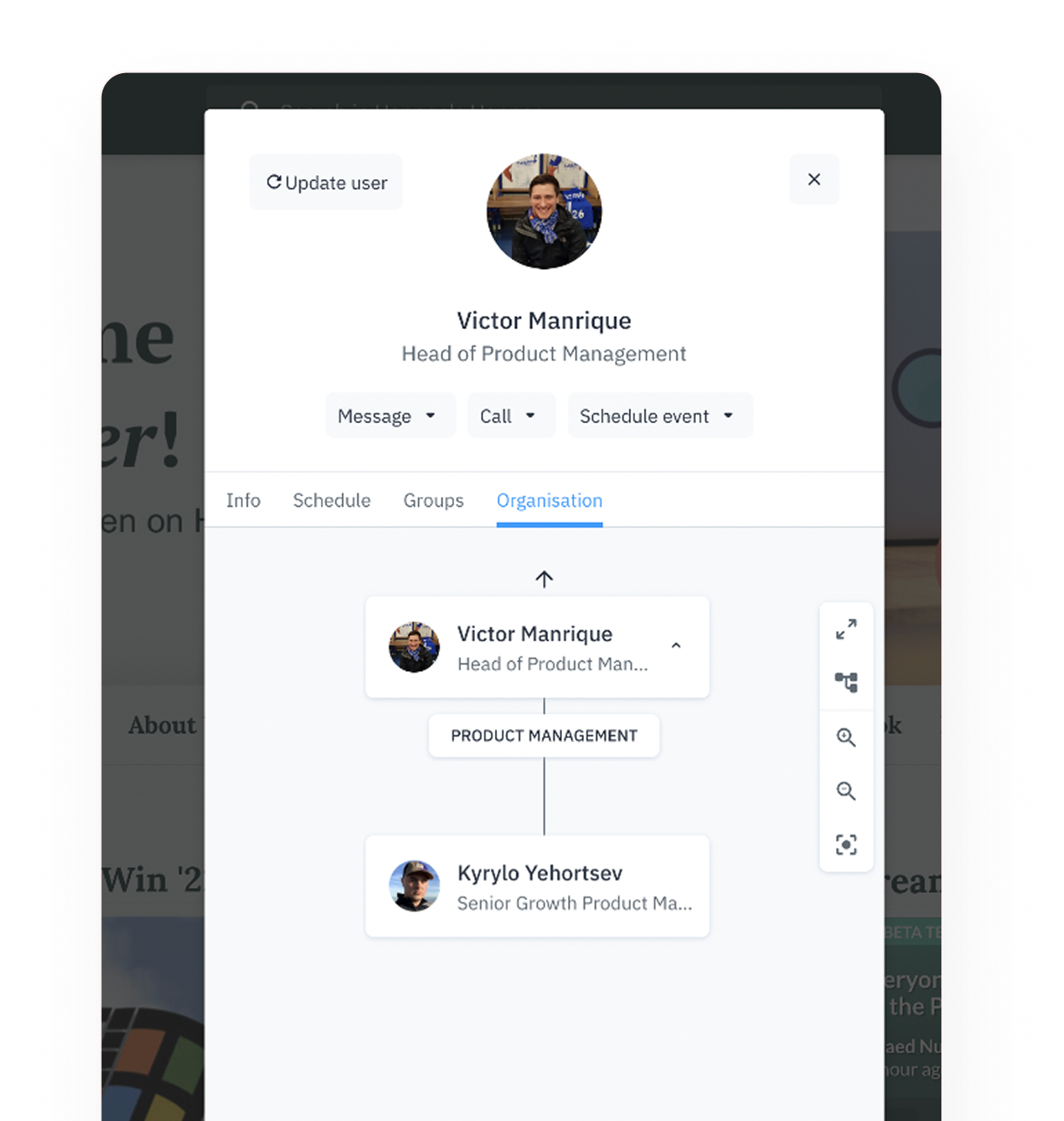
The directory was a flat alphabetical list with no way to understand team structure, reporting lines, or who the relevant person was in a given department. New hires especially had nowhere to start.
Design Audit
A systematic review of the existing interface revealed three core usability problems: no filtering capability, minimal profile information, and a layout that didn't scale for large organisations.
Research
We surveyed 45 Happeo users across 12 organisations and ran discovery interviews to understand how employees were actually using people discovery, and where they were giving up on the directory entirely.
Most employees relied on direct messages or Slack to find colleagues rather than using the built-in directory, it wasn't worth the effort.
For teams larger than 100 people, the absence of filtering by department or role made the directory functionally useless for discovery tasks.
Nearly all users wanted to see department, title, and location before clicking into a full profile, reducing unnecessary profile page visits.
Over half of surveyed users were either unaware the people directory existed or had stopped using it after a single poor experience.
Success Metrics
Working with the PM team, we defined four key success dimensions to evaluate the redesign, giving us clear before/after benchmarks and post-launch tracking goals.
Reduce the average steps needed to find a specific colleague. Target: find any person in under 3 interactions from the directory landing page.
Enable filtering by at least 3 attributes (department, role, location). Track filter usage rate as a core engagement metric post-launch.
Increase directory session frequency and depth. Measure page views per session, return visits, and time spent compared to the old interface.
Drive profile completion rates and connections initiated via the directory. A richer directory only works if profiles are populated, track both sides.
Moodboard
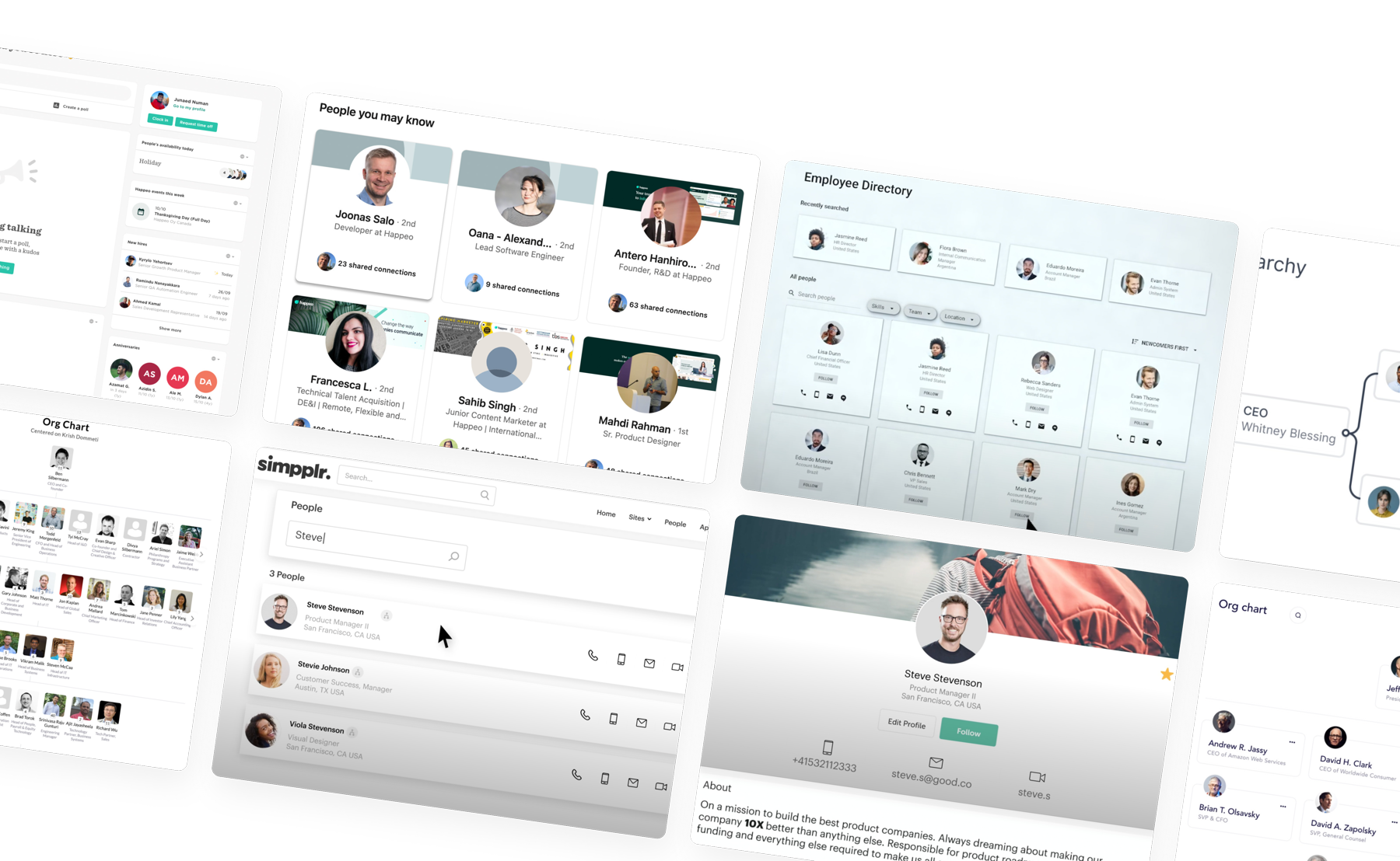
Competitive analysis and visual inspiration informed a clean, information-dense aesthetic, balancing the density needed for large org directories with the warmth that encourages genuine connection.
Testing
We ran moderated usability sessions with 6 participants across organisations of 50, 200, and 800+ employees. The sessions uncovered 4 critical issues that were addressed before the final release, particularly around filter interaction and profile card hierarchy.
Final Design
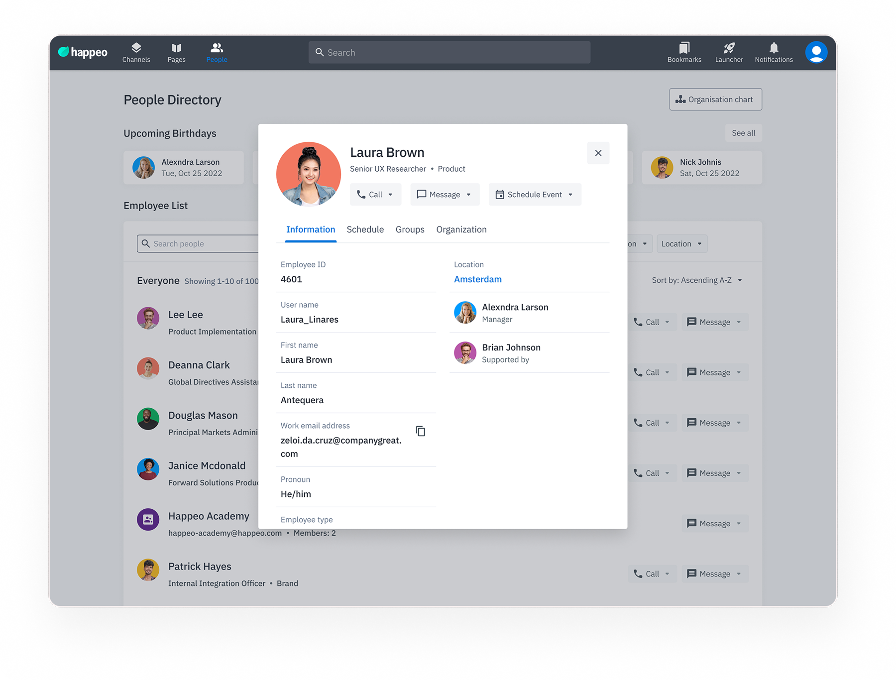
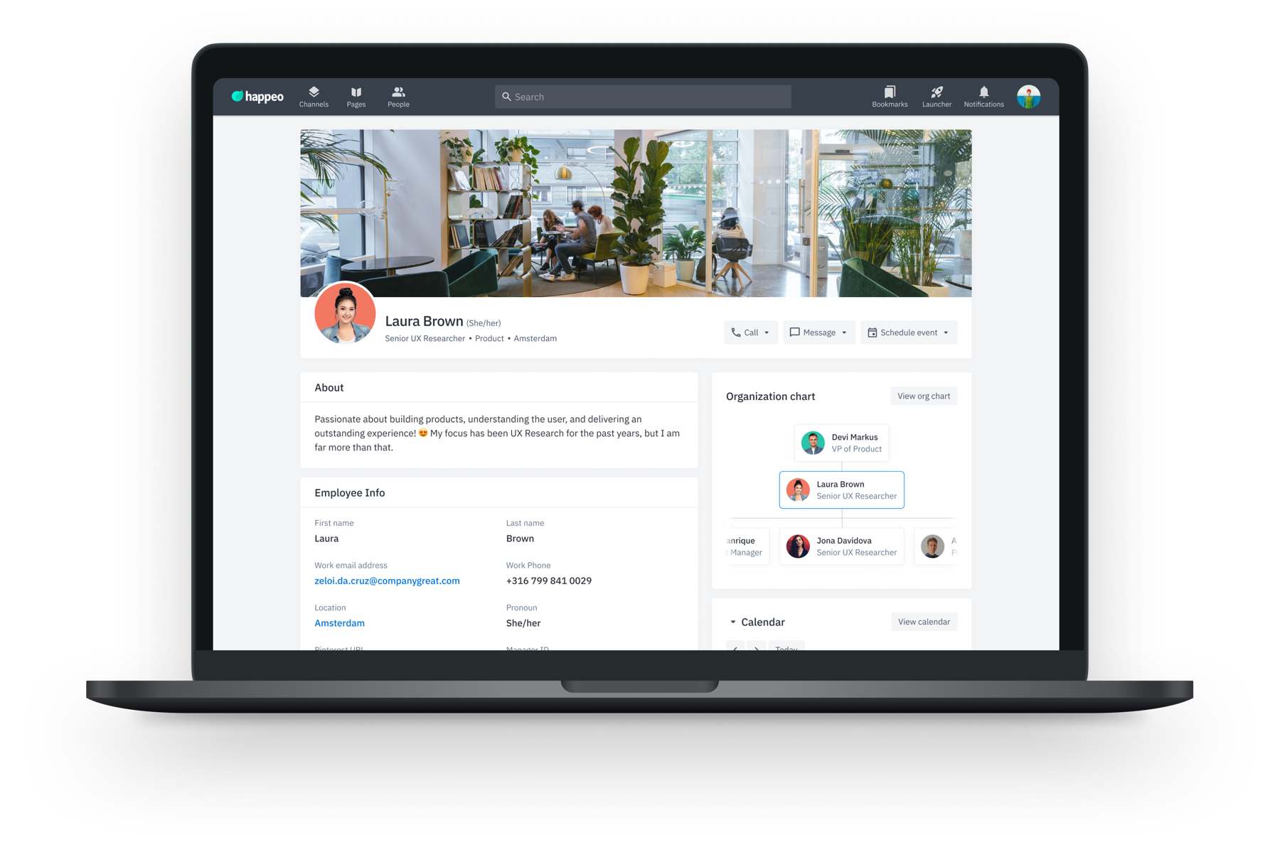
The redesigned People Directory gave employees the tools to find colleagues the way they actually search: by role, team, or location, not by exact name recall. Smart filtering, richer profile previews, and a scalable layout turned an ignored feature into a daily-use tool.
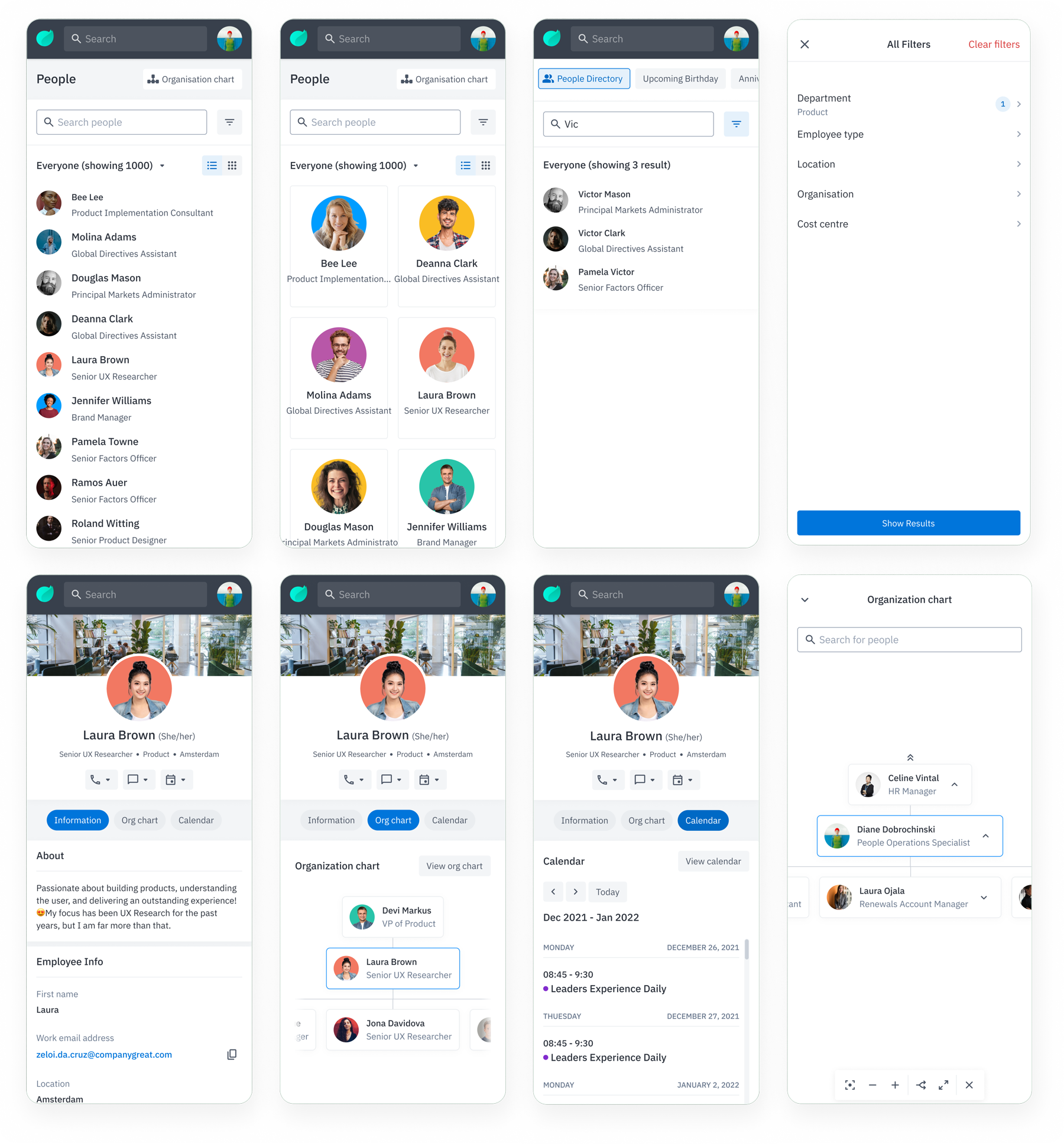
Filter colleagues by department, location, job title, and custom org attributes, making it easy to find exactly who you need, even in a 5,000-person org.
Preview key information, role, team, location, and direct contact, from the directory without needing to open a full profile page.
Results ranked by relevance to your team and recent interactions. Fuzzy matching handles name variations and typos, so finding the right person no longer depends on knowing the exact spelling.
Consistent avatar sizing, presence indicators, and a clear information hierarchy make it faster to scan 50 profiles than the old layout made it to read 10.
People Directory, redesigned browsing, filtering, and profile discovery flow
Responsive Design
Designed mobile-first with responsive breakpoints for tablet and desktop. The directory adapts from a single-column list on mobile to a rich grid with sidebar filtering on larger screens, the same powerful discovery tool on every device.
Impact
Post-launch analytics and client feedback confirmed that the redesign meaningfully changed how employees use and value the People Directory, across all tracked dimensions.
70%
More employees visiting the directory regularly and spending longer in each session, a signal that it became genuinely useful.
40%
Users navigating deeper into the directory, exploring profiles, using filters, and making connections, not just landing and leaving.
25%
The smart filtering and richer profile cards reduced the average time to locate a specific colleague by a quarter.
100%
All client accounts surveyed post-launch rated the new directory as a significant improvement over the previous version.
Conclusion
The 70% engagement jump told us something specific: this wasn't about users suddenly caring more about the directory. It was about removing the barriers that had been stopping them from using it. Filtering, richer profile cards, and better search didn't add value, they removed friction that had been hiding value that was already there.
The next opportunity would be social presence, encouraging profile completion so the directory becomes more useful as more people fill it in. A directory is only as strong as the profiles inside it. That feedback loop between tool quality and data quality is something I'd prioritise as a fast follow.