Work About Resume Let's Talk →
Back to Portfolio
Mobile UX Design Pathao · 2018

Redesigned Food Delivery Flow for Pathao Drive

Pathao's delivery heroes were completing 10+ deliveries a day with an app that wasn't designed for them, too many taps under pressure, unclear status at every step, and no way to manage orders without pulling over. I redesigned the complete delivery partner flow: 5 core screens, from order request to drop-off confirmation. Result: 10% improvement in order completion rate and a 60% reduction in taps per delivery.

TL;DR

Problem: Delivery heroes were navigating traffic and managing orders on an app built for office desks, confusing flows, too many taps, unclear status. What I did: Field research with delivery partners, redesigned all 5 screens of the delivery flow, prototyped and tested with real heroes. Impact: 10% uplift in order completion, 60% fewer taps per delivery, meaningfully higher hero satisfaction scores.

Problem

The existing app required 4–5 taps for core actions, had unclear status at each step, and forced heroes to switch between screens to get basic order info, all while riding in dense Dhaka traffic.

Approach

Field observation with active delivery heroes, task analysis, wireframe ideation, high-fidelity prototyping of 5 screens, usability testing with real delivery partners.

Evidence

Real-world workflow observation, delivery hero interviews, prototype testing sessions, iteration on pick-up and drop-off failure points, post-launch hero satisfaction data.

My Role

End-to-end: field research, task analysis, wireframing, UI design, prototyping, and usability testing. Owned the design from problem discovery through to release.
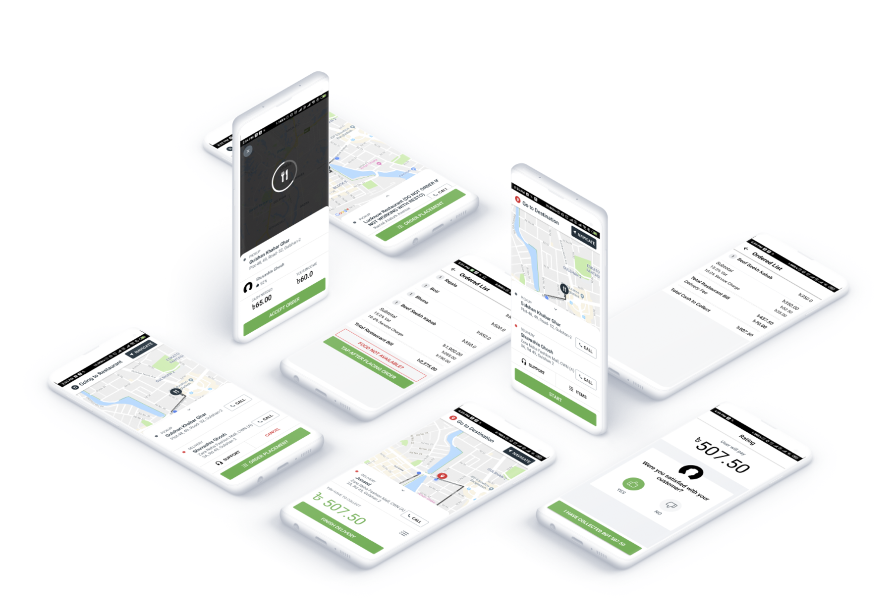
Pathao Drive — redesigned food delivery flow overview

Where the old app was failing heroes

Field research and interviews with active delivery partners revealed consistent, costly friction points. The existing interface was designed without considering the real-world context of delivery work, navigating traffic, handling bags, and making split-second decisions.

Confusing Order Flow

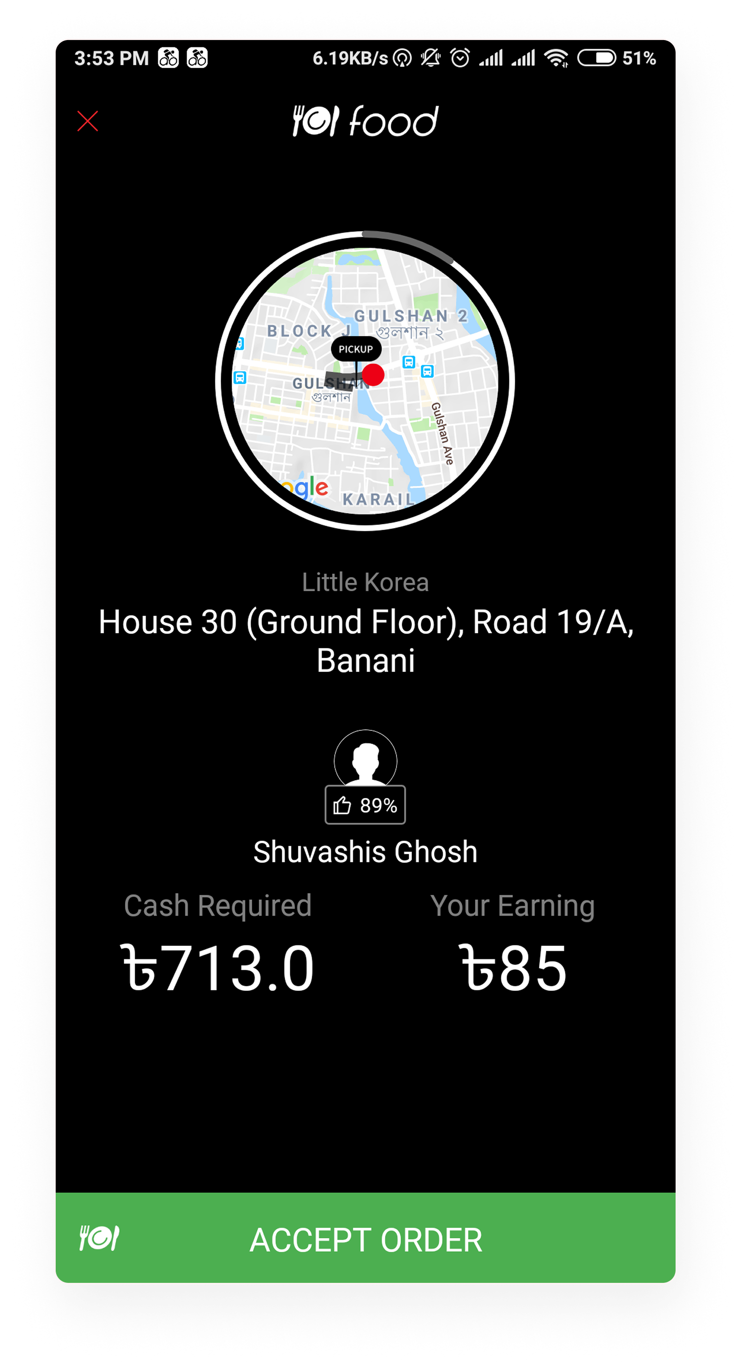
Accepting and tracking orders required multiple screens with unclear states. Heroes tapped the wrong action under time pressure, causing order confusion and failed deliveries.

Too Many Taps

Core actions like confirming pickup or marking delivery required 4–5 taps. For heroes completing 10+ deliveries a day, the extra friction added up to lost earnings.

Unclear Status Indicators

Heroes were unsure which step they were on, pickup, en route, or delivered, leading to errors, missed confirmations, and repeat customer contacts.

Poor Navigation UX

Switching between map, order details, and customer contact required too many screen transitions, a critical inefficiency when riding through dense traffic.

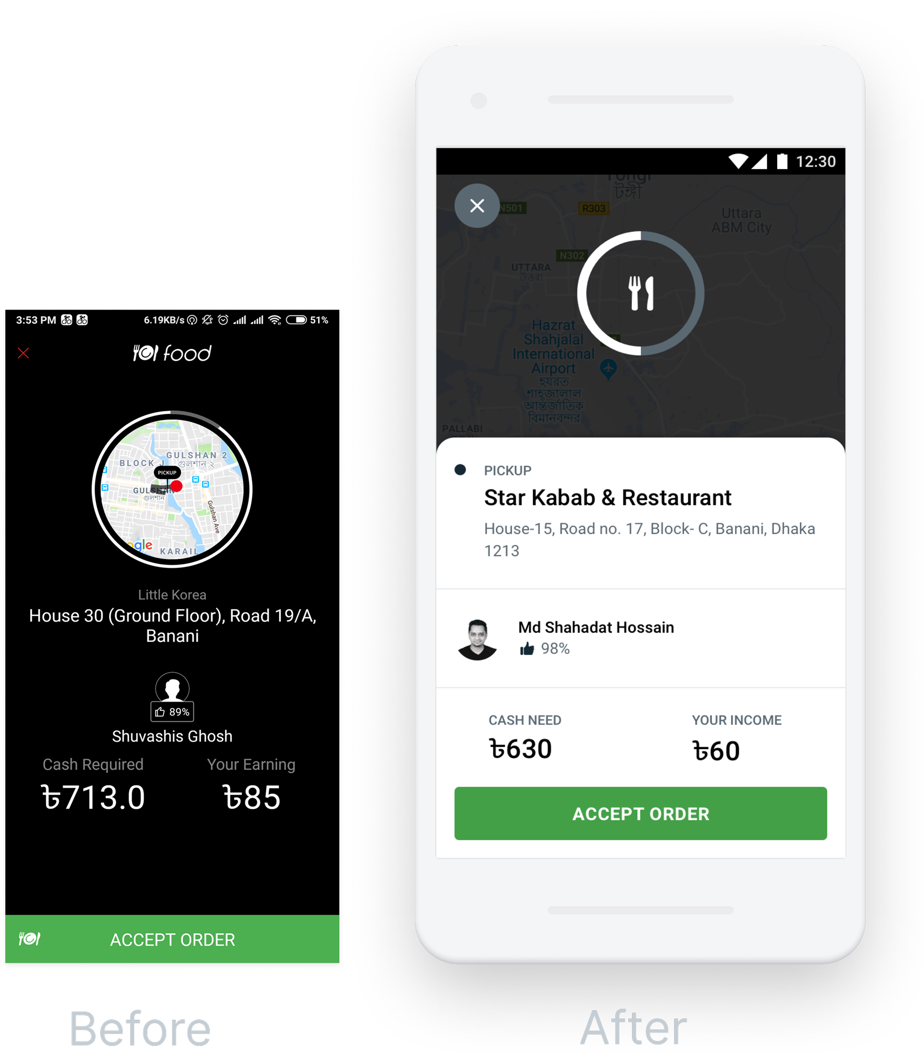
Old Pathao Drive UI — order request screen with confusing layout
Old Pathao Drive UI — delivery flow showing too many steps

Mapping the complete delivery hero journey

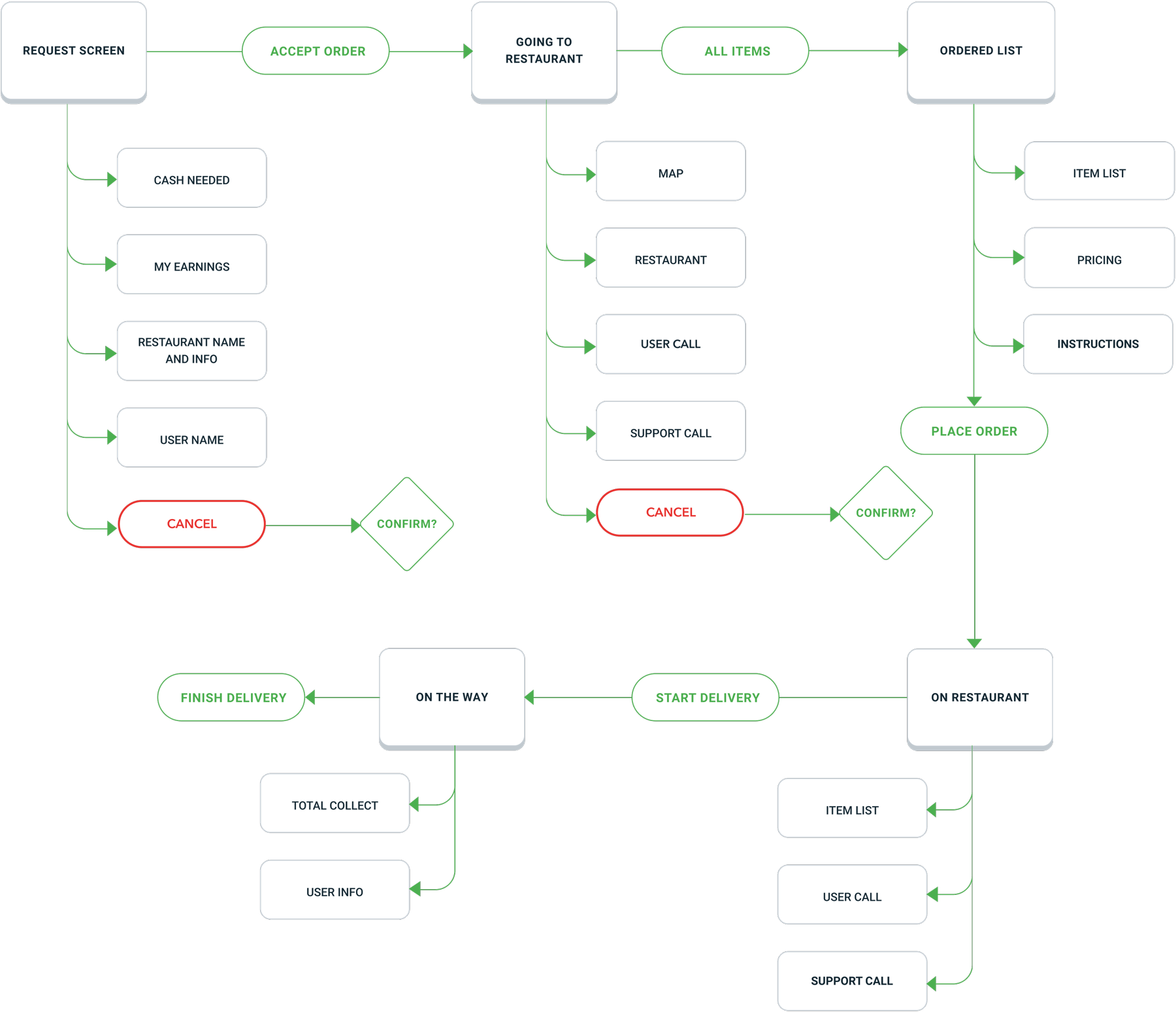
We mapped the full delivery partner workflow, from receiving an order request to confirming drop-off, identifying the exact moments where the current flow was breaking down and where design could reduce cognitive load most effectively.

Pathao Drive — complete food delivery hero user flow diagram

Streamlining every step of the flow

The redesign focused on three principles: reduce cognitive load, surface only what's needed at each step, and make the most important actions reachable with one thumb. Here's every step of the new flow.

Step 01

Request Screen

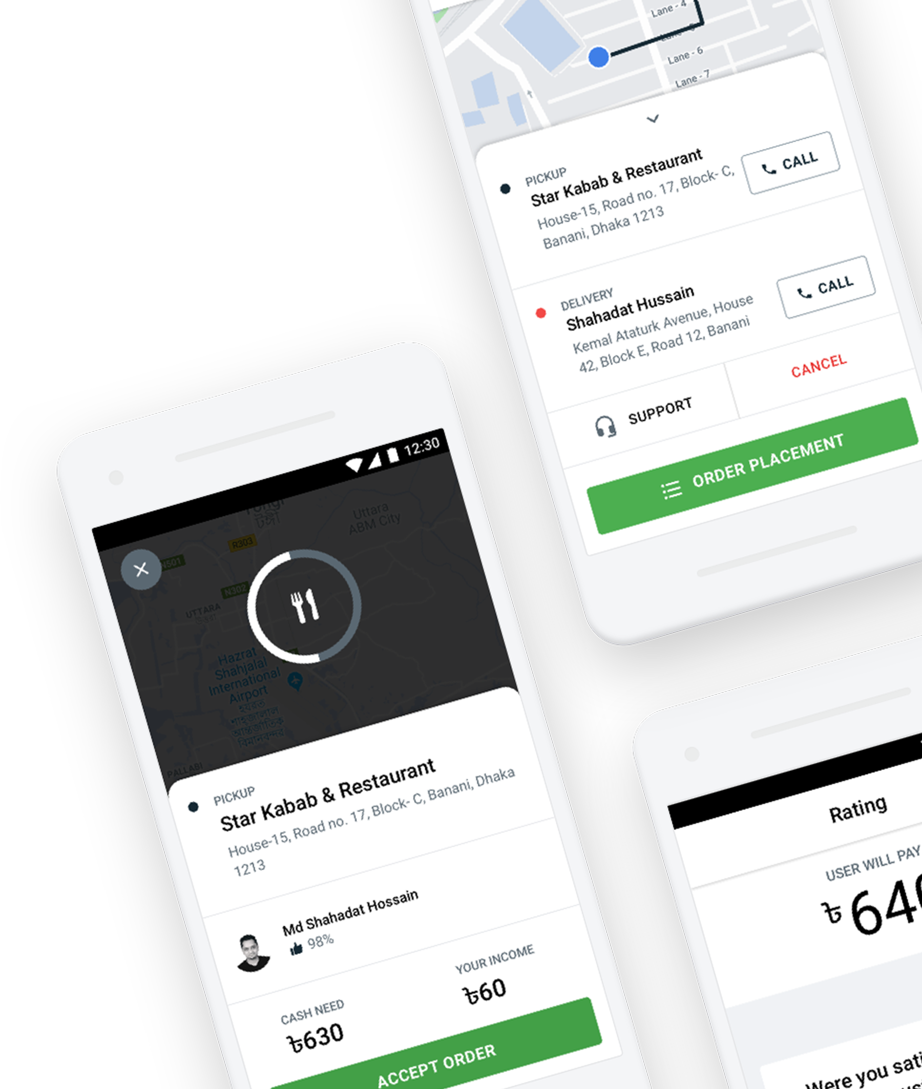
When a new order comes in, heroes need to make a fast accept/decline decision. The redesigned request card surfaces the key info, restaurant name, earnings, and distance, in a clear layout with a single, prominent ACCEPT button that's impossible to miss, even while moving.

  • Earnings shown upfront before accepting
  • Restaurant distance and estimated travel time
  • Large ACCEPT CTA designed for thumb reach
New request screen — order incoming card with key info
Request screen — illustrated delivery scenario
Step 02

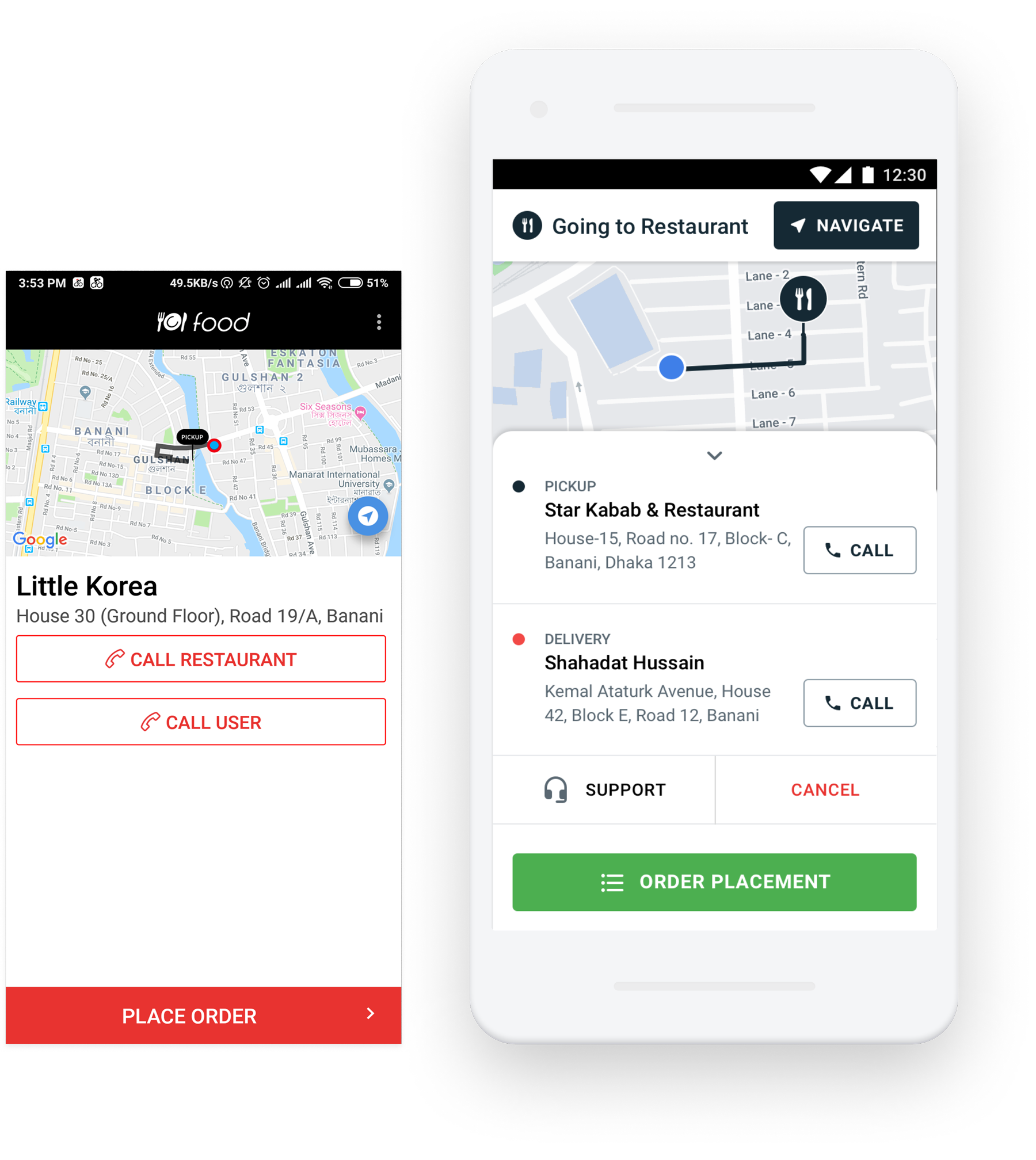
Order Placement

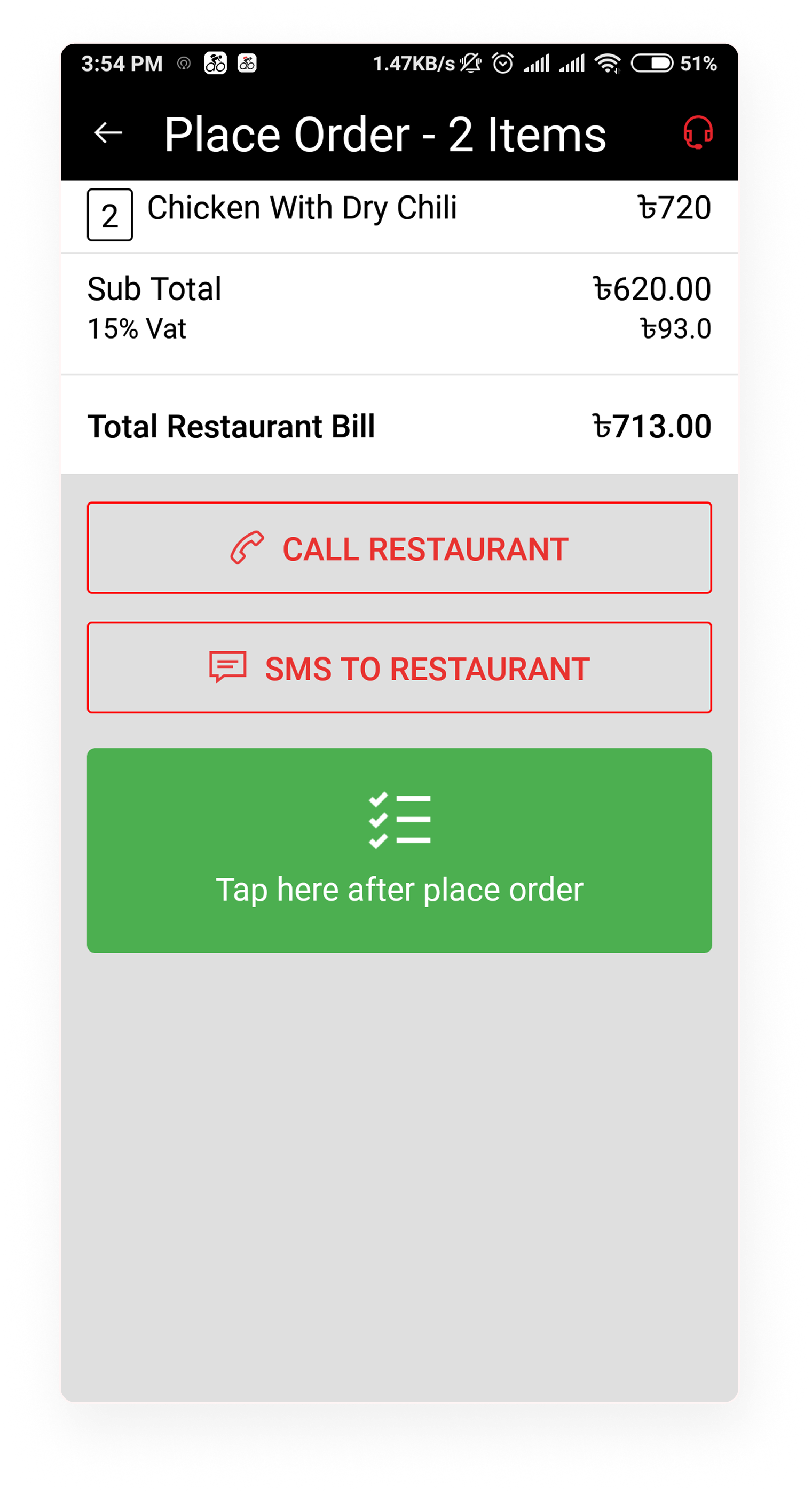
After accepting, heroes see the complete order breakdown, item count, special instructions, restaurant location, and one-tap navigation. No drilling through sub-screens. Everything needed to execute the pickup is visible on a single card.

  • Full order details on one screen
  • One-tap navigation to restaurant
  • Special instructions always visible
Order placement screen — complete order details
Order placement — illustrated pickup scenario
Step 03

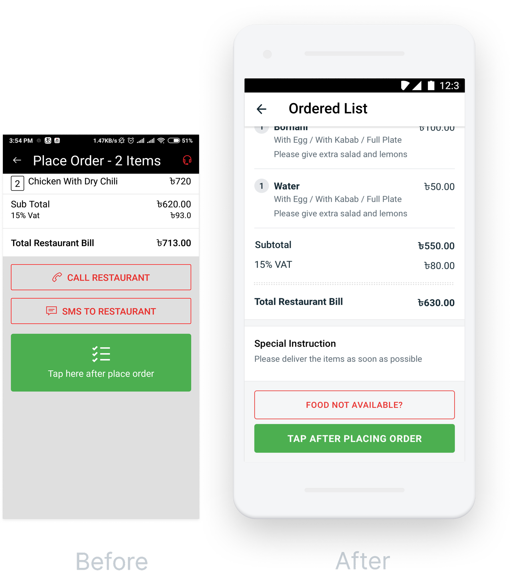
Ordered List

For heroes managing multiple deliveries, the order queue gives a clear prioritised view, with status badges, estimated completion times, and earnings per order. At a glance, heroes know what's next without any tapping or scrolling through unclear states.

  • Prioritised queue with clear status badges
  • Earnings visible per order in the list
  • Estimated time to completion per item
Ordered list screen — delivery queue with status indicators
Ordered list — illustrated multi-order management scenario
Step 04

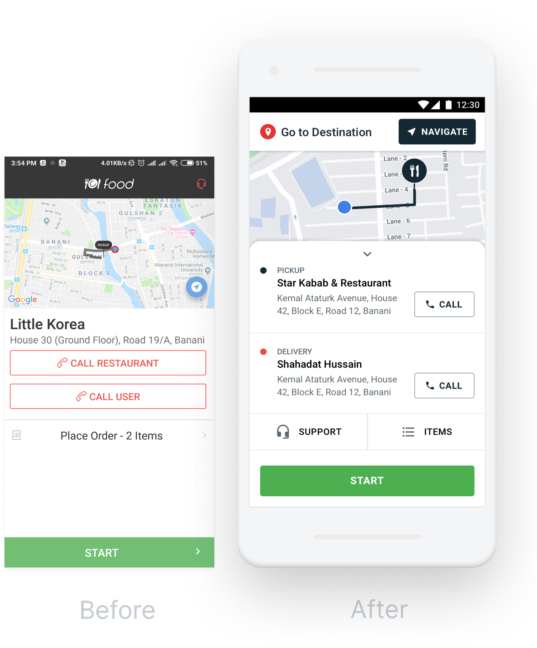
Start Delivery

The pick-up confirmation screen is stripped down to the essentials: confirm items collected, then tap once to start delivery. The oversized CTA is designed for one-handed use while holding a bag, and the step indicator keeps heroes oriented in the overall flow.

  • Item checklist for confirmation before pickup
  • Persistent step indicator (Accept → Pickup → Deliver)
  • Single-tap START DELIVERY CTA
Start delivery screen — pickup confirmation with step progress
Start delivery — illustrated pickup scenario
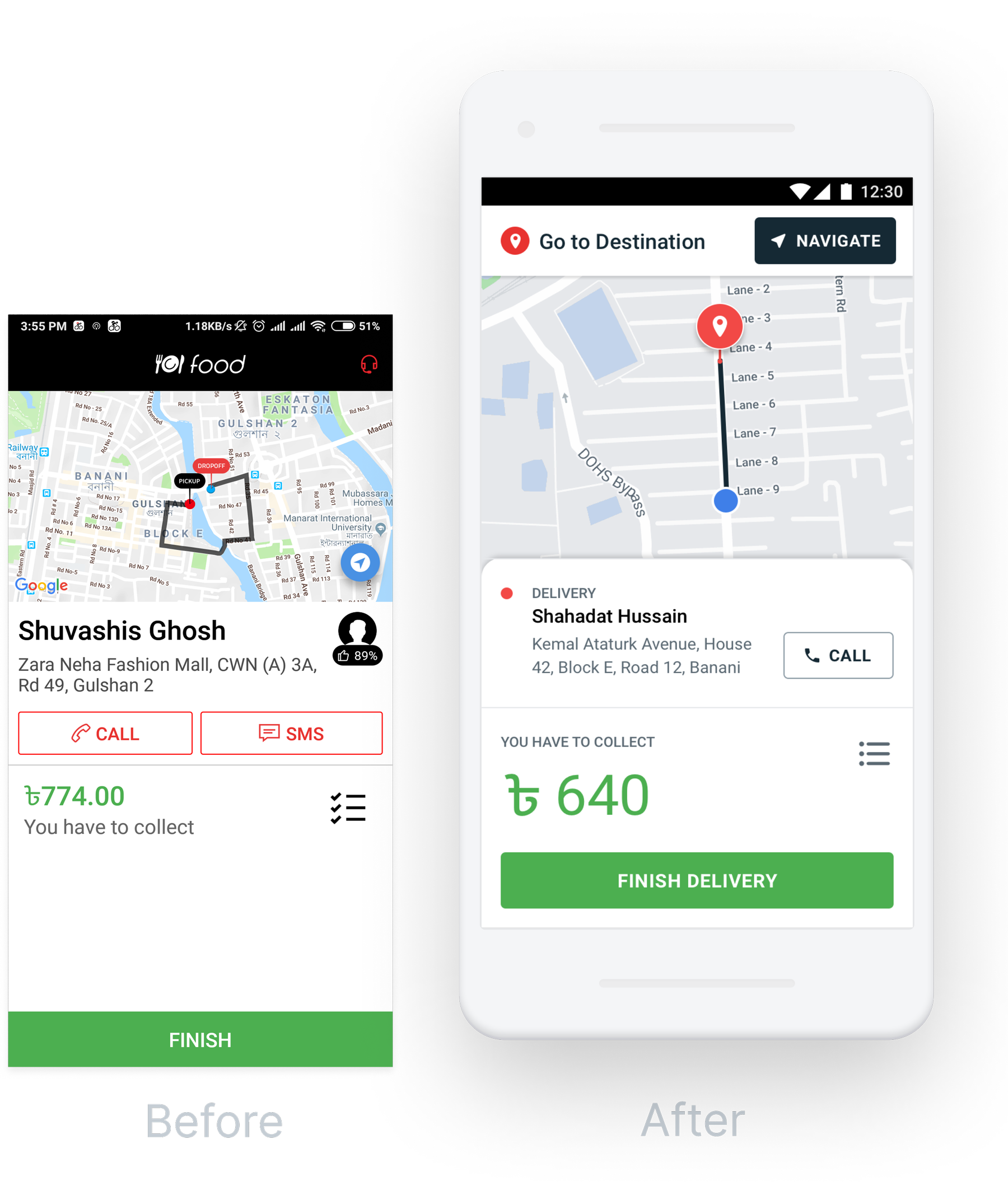
Step 05

Finish Delivery

Drop-off confirmation surfaces address verification, a photo upload option for proof of delivery, and an instant earnings update. The clear success state reduces ambiguity, repeat customer contacts, and delivery disputes, ending each job on a confident note.

  • Address verification at the door
  • Optional photo proof of delivery
  • Instant earnings update on completion
Finish delivery screen — drop-off confirmation and earnings update
Finish delivery — illustrated drop-off scenario

The complete redesigned flow

Every screen in the redesigned Pathao Drive delivery flow, from initial order request through to successful drop-off, in a single overview.

Pathao Drive — all redesigned screens in device mockup

Faster, cleaner, less error-prone

Post-launch data and hero feedback confirmed that the redesigned flow meaningfully reduced errors and time-on-task, translating directly into more deliveries per shift and higher hero satisfaction.

10%

Order Completion Rate

Improvement in successful delivery completion, driven by clearer step indicators and reduced tap errors.

↓ 60%

Reduced Taps Per Delivery

Core delivery actions cut from 4–5 taps to 1–2, removing friction from every single order in the shift.

↑ Sat.

Higher Hero Satisfaction

Post-launch feedback from delivery partners showed significantly higher ease-of-use ratings and less reported stress during peak delivery windows.

What this project taught me about context-first design

Working on Pathao Drive was a lesson in designing for extreme constraints. Our users weren't sitting at a desk with time to think, they were on motorbikes, in traffic, under time and earnings pressure. Every extra step in the UI had a real human cost.

It reinforced a principle I carry into every project: the best interface is the one that disappears. When the design works, heroes stop thinking about the app and focus on the job. That's the goal.