Transfer pricing teams at large enterprises were failing to complete their Master File documentation inside TPDoc, not because the data wasn't there, but because the workflow was fragmented, opaque, and impossible to navigate without prior knowledge. I redesigned the end-to-end experience into a guided progressive workflow. Validated with 9 participants in Maze testing: 100% task success rate, 8.8/10 usability score.
TL;DR
Problem: Master File creation was spread across disconnected sections. New users didn't know what to complete, in what order, or how far along they were. What I did: Designed a new dedicated workflow with guided navigation, chapter progress states, and in-tool document preview, replacing a fragmented, Dox42-based experience. Impact: 100% task success in Maze testing, 8.8/10 ease-of-use score, and strong early adoption feedback confirming users found it significantly clearer to navigate.
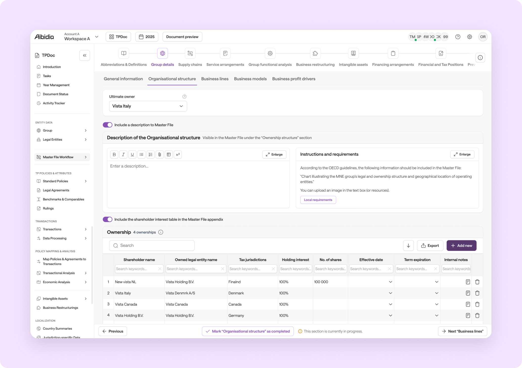
Full workflow prototype, end-to-end master file creation
Master File preparation was scattered across multiple sections in TPDoc with no clear sequence, no progress visibility, and no way to review the output in context. Teams were finishing the process in Word, outside the tool.
Introduced a dedicated progressive workflow with guided chapter navigation, completion states, and in-tool document preview to replace the fragmented, Dox42-based experience.
Customer interviews (Scania, Dyson, Viega), competitor synthesis, internal Productboard synthesis, and Maze prototype validation with 9 participants.
End-to-end: research synthesis, interaction design, prototyping, usability testing. Close collaboration with PM and engineering on scoping constraints and delivery timeline.
Context
Master File creation was fragmented across multiple sections in TPDoc, no single coherent entry point, no completion visibility, no clear ordering. New users routinely needed support to complete a workflow they were expected to repeat annually. The underlying Dox42-based generation was also inflexible, requiring manual Word editing after export.
Business pressure: customers were expected to start submitting Master Files to tax jurisdictions by Q2, increasing urgency to ship before that window.
A single, coherent workflow aligned to the final document structure. Progress visibility so users know what's complete and what's missing. Flexibility for narrative content, not just rigid form fields. And a preview experience so teams could review the output without leaving TPDoc.
The redesign also had to be scoped to what engineering could deliver for the Q2 deadline, which meant making hard trade-offs on what to include in V1 versus the next iteration.
Research
Across customer interviews and internal synthesis, the same issues appeared repeatedly: unclear navigation, weak change visibility, too much manual coordination, and limited flexibility once the document needed review or tailoring.
Participants described not knowing where to edit content, where a change would appear, or how the workflow was supposed to move forward.
Users wanted clearer history, clearer audit trails, and better visibility of who changed what and when.
Review often happened outside the product through email and shared files rather than inside a connected workflow.
Internal and competitor synthesis highlighted a need for more flexible chapter structure and fewer post-generation edits.
Teams lacked centralized workflow management, ownership clarity, and progress signals, leading to manual coordination.
Users asked for a more approachable experience, especially for people who are not deep TPDoc experts.
"Couldn't find the text where to edit in the tool. Lack of knowledge about tool's logic."
— Interview insight (Scania)
"Reports are drafted in the tool, exported as Word files, manually reviewed across multiple levels (team, business, audit), and changes tracked offline (e.g., OneDrive, Excel)."
— Interview insight (Dyson)
"It was quite hard to understand where to go…Should be easy language."
— Interview insight (Viega)
Solution
The concept moved TPDoc from fragmented navigation to a progressive workflow. The new interaction model surfaces the right chapter at the right time, while still giving experienced users shortcuts and control.
The new Master File Workflow sits as its own entry in sidebar navigation, making the start of the journey easier to find. Hovering over it users can jump straight to a chapter without entering sequentially first.
Reviewing the generated document can now be done within the tool, ensuring users do not have to communicate back and forth outside the tool.
A navigation bar mirrors the structure of the output document and makes section relationships visible at a glance.
Previous/Next actions, "mark as complete", and an in-progress indicator help users understand status and keep moving.
User Flow
The 10-step guided wizard replaces six disconnected sections with a single progressive path, from entry through each documentation chapter to preview and download.
Navigation
NAVIGATION
Workflow navigation: The workflow navigation bar gives both a sequential path and direct section access, which responds to feedback about not knowing where to go next.
Content Model
The redesigned flow was not only about navigation. It also added more room for narrative context inside chapters, helping teams capture information that does not fit neatly into rigid structured fields.
Rigid, hard-to-adjust structures that forced manual clean-up after generation. A lack of narrative room for explaining nuances, jurisdictional context, or supporting detail. An output workflow that felt closer to data entry than documentation authoring.
Every chapter except Abbreviations and Definitions includes a dedicated description area. The description area supports long-form writing, images, footnotes, and tables through a rich-text editor. Descriptions are enabled by default but can be turned off when they are not needed.
This direction aligns closely with external feedback asking for more flexible structure and easier in-tool review before finalizing documents.
Explored: Not Shipped
During solution brainstorming, several AI and automation capabilities were prototyped to reduce the manual effort involved in completing a Master File. These were validated as high-value but deferred from V1 due to engineering capacity and Q2 delivery pressure.
A contextual AI assistant embedded inside each chapter's rich text description area. Users could prompt it to draft narrative content, rewrite for tone, or generate boilerplate based on the chapter type and available entity data. Particularly valuable in sections requiring legal or financial narrative where consistent language and phrasing matter.
Automation to parse an uploaded document (a prior Master File PDF or previous year's submission) and pre-populate relevant chapter fields. Eliminating repetitive re-entry for returning users and enabling year-on-year continuity without starting from scratch. The biggest time-saver for teams who submit annually.
Users could describe what they wanted to fill, like "populate Supply Chain from our last submission", and the system would map the instruction to fields and complete steps automatically. A natural-language entry point to an otherwise manual, multi-step process that requires deep familiarity with the data structure.
All three concepts were scoped out of V1 to meet the Q2 deadline. Engineering complexity and the need for LLM integration were the primary constraints. They remain the highest-priority candidates for the next iteration.
Validation
A Maze prototype test with 9 participants was used to validate whether the proposed workflow made key actions easier to find and complete. Two core tasks were tested: navigating to the workflow entry point, and completing a documentation review within the tool.
All 9 participants completed both tasks successfully. Clearer button labels and the structured chapter navigation were called out explicitly as improvements. One participant noted: "I previously reviewed in Word, knowing this is in the tool makes it even easier."
Task 2 (reaching document review) had a 34% misclick rate despite full completion, indicating the path was findable but not obvious. One participant asked to "visualise the whole workflow upfront," which reinforced the case for a stronger overview state or progress map.
Impact
The Master File Workflow redesign helped transform a fragmented documentation process into a more structured, guided, and usable experience for TPDoc users.
Replaced a scattered multi-section experience with a single dedicated entry point, users no longer had to discover where to start.
Chapter navigation, progress states, and "mark as complete" removed the most common complaint: not knowing what was done or what was left.
Every chapter except Abbreviations got a dedicated description area with a rich-text editor, no more post-generation Word editing for narrative content.
9 participants, 100% task success, 8.8/10 ease-of-use in Maze testing, strong signal the direction was right before a single line of production code was written.
Post-launch feedback from internal teams and early customers matched what testing predicted: clearer, faster, and far less reliant on tribal knowledge to complete.
Post-Launch
After internal release and beta rollout, the response was strongly positive, but a few useful improvements emerged.
Abbreviations and Definitions may belong later in the workflow, since users often complete it last in practice. Group Details may work better as the landing page, since it feels like a more natural starting point. A few copy and empty-state refinements were identified, but overall feedback was very positive.
The next iteration has two clear focus areas. First, improving the preview experience: introducing HTML-based preview, direct navigation from output back to source data, in-tool commenting, and stronger collaboration workflows, turning preview from a static output into a real review layer.
Second, bringing in the AI and automation concepts explored during V1 but deferred: an AI writing assistant in the rich text editor, document-to-data extraction from uploaded prior submissions, and instruction-based auto-complete for chapter fields. These were the highest-value ideas from the brainstorming phase. The V1 constraints just pushed them forward.
Conclusion
This project was about making a genuinely complex compliance workflow feel structured and navigable, not just aesthetically cleaner, but actually usable for someone doing it for the first time. The core insight was that users didn't struggle with the data; they struggled with the system. No clear path, no sense of progress, no way to review without leaving the tool.
The solution treated the workflow as a document structure problem as much as a UX problem, chapters map to the output, the navigation mirrors the final document, and progress states reflect real completion criteria. That systems-level thinking is what made the design hold up under testing and in production.
Next: turning the static preview into a real review and collaboration layer, and bringing in the AI capabilities that were explored but deferred: writing assistance inside the editor, document extraction from prior submissions, and instruction-based auto-complete. The workflow foundation is solid. The next iteration is about making it significantly faster to complete.